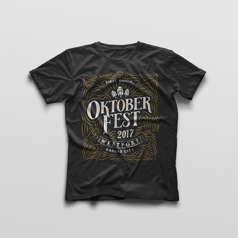
While at Fire Engine Design Studio, I was tasked with designing a t-shirt for the Westport Regional Business League to sell in tents at their first annual Oktoberfest festival.
I was inspired by labels on craft beers for the design, and because the client didn’t want us to include images of beer on the shirt, I was able to imply beer by illustrating little hops as design accents. I modeled my lettering after ornamental fonts that were still legible and that I felt had a distant kinship to blackletter without the illegibility of blackletter.
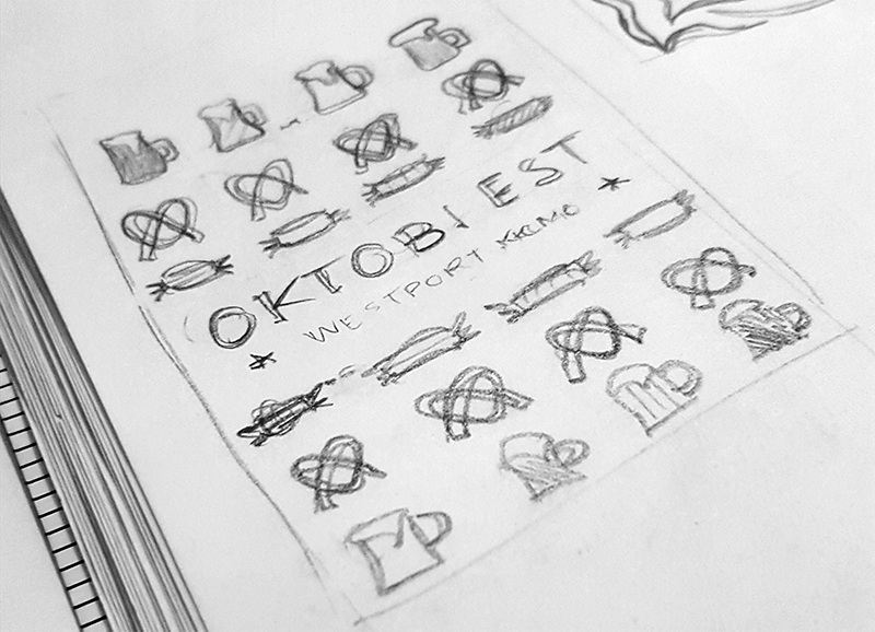
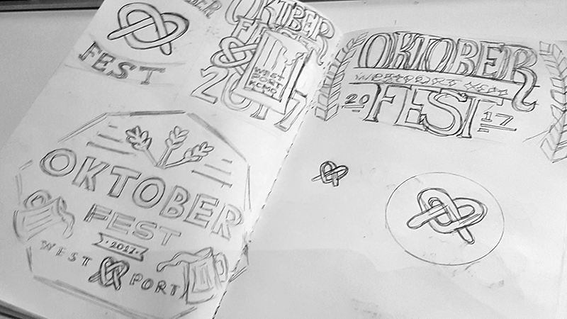

As with all my projects, I started the t-shirt project by sketching several ideas. Then I designed this t-shirt by hand, drawing it on paper, then scanning and digitizing the file and preparing it for screen printing.

The shirt would only be available in one color version, so I selected unisex colors that would sell well during the autumn, grey, gold, and white.