A U.S. Bank-supported credit program spanning multiple brands needed an email campaign, customized for each U.S. Bank, REI Co-op, and Elan. Working with developers to produce responsive design results, I designed each of the emails in both Desktop and Mobile layouts.
SERVICES
Email Design

U.S. Bank, REI Co-op, and Elan needed an email on the topics of Checklist, Online Banking Benefits, and Purchase Benefits. Each of those emails had 2 variations – one that was customized for users that already have the US Bank Mobile App, and one tailored for the users that have not yet downloaded the Mobile App. The US Bank brand had an additional email to send to existing customers encouraging them to upgrade to the Connect Visa Signature card.
US BANK
Using U.S. Bank’s blue and red color palette and brand fonts, as well as choosing stock images that support the brand’s look and feel, I designed the following emails for US Bank. The client provided logos, brand guide, examples of other emails, and a copywriter provided the messaging options and variations.
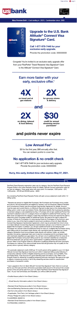
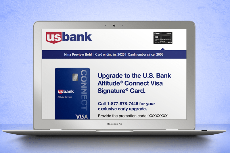
Upgrade Connect
The purpose of this email was to encourage existing U.S. Bank customers to upgrade their card. This email was sent as an “early-access” benefit to customers with FlexPerks® Travel Rewards Visa Signature® Cards, and it highlighted the benefits of upgrading to the next program, the U.S. Bank Altitude® Connect Visa Signature® Card. It ends with the phone number to call to upgrade and promotion code to ensure the offer.
This email was only needed for the U.S. Bank brand. The rest of the emails were needed each for U.S. Bank, REI, and Elan. Due to the developer’s platform, there is some uniformity across the layouts, in spite of being different brands, but I used logos, colors, and imagery to help distinguish each email as its brand.
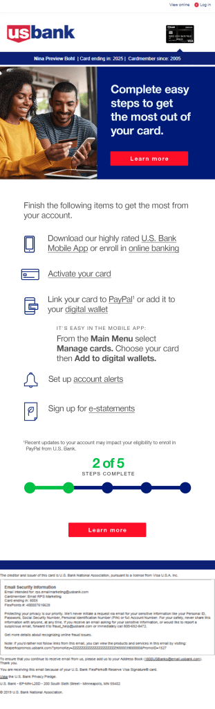
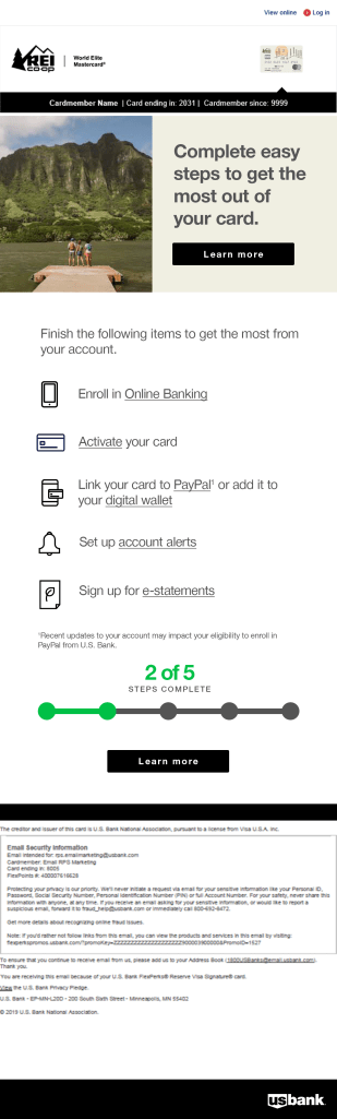
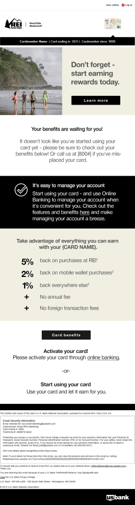
Checklist
Customers at the beginning of the process would receive these emails – ones that had signed up for the account and received their physical card, but had not yet activated the card, enrolled in the program’s benefits and features, downloaded or set up the Mobile App.
The email features a list of links for users to begin the different processes that would interest and benefit new customers. Instead of a bulleted list, I used icons to support the message or action beside it.
For the user’s benefit, at the bottom of the email, there’s a visual representation of how many steps they have completed, and how many they have yet to complete in the process. After this visual prompt, we placed a second CTA button to give them the immediate ability to complete further steps.
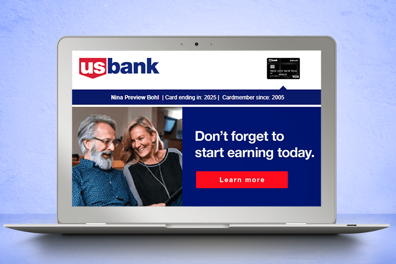
Purchase Benefit
This email is about prompting new customers to explore the benefits now open to them. The first button gives them the opportunity to go to the rewards page to learn the details of the benefits. Then we outline the benefits of using the cards, highlighting the cashback percentages. Following that, there’s another button that takes users to the benefits program of their card.
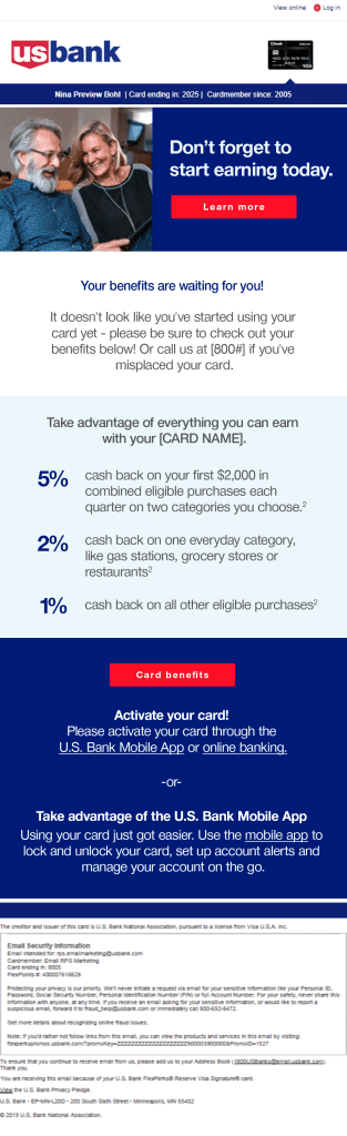
We also wanted to direct any new customers to activate their card, and download the Mobile App, so after the initial benefits message, we put prompts with links for each of those endeavors.
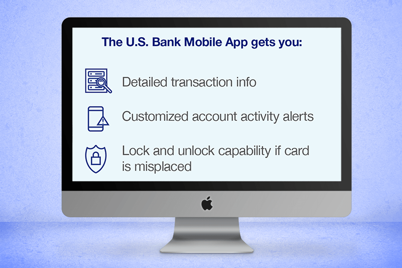
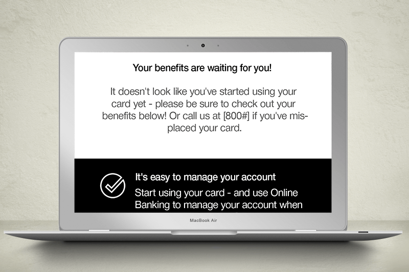
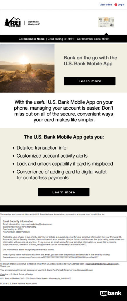
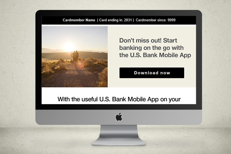
Online Banking Benefit
This email focuses on the Mobile App, appealing to audiences through a message of convenience. For those who didn’t already have the Mobile App, the message enticed the audience to download the app to make life simpler. For those who already had the Mobile App, the message advocated the convenience of online banking in an effort to get them to download the App and start using it.
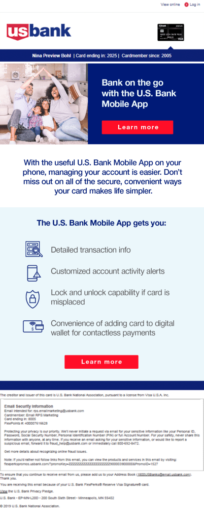
US Bank needed 2 versions of this email. The difference was less in the design, and more in the messaging, highlighting the benefits of the online banking program. One version is for customers who already have the Mobile App, directing them to visit it, and the other is for customers who have not yet downloaded the Mobile App, and it prompts them to download it with a call-to-action button. See the subtle variations in the emails below.

REI CO-OP
The next are a series of similar emails for REI Co-op, a recreational equipment outfitter. Using REI’s brand colors fonts, and finding stock images that support the brand’s outdoorsy look and feel, I designed the following emails for REI Co-op. The client provided logos, brand guide, examples of other emails, and a copywriter provided the messaging options and variations.
Checklist
This email is about bringing new customers into the program, showcasing the benefits of the program with links, prompting users to check them out, learn more, activate their card, and download the supporting US Bank Mobile App for online banking convenience.
The email features a list of links for users to begin the different processes that would interest and benefit new customers. Similar to the US Bank emails, I used icons to support the messages. The monoline styling of the icons is similar, but the icons themselves are different than US Bank’s, unique to REI Co-op.
For the user’s benefit, at the bottom of the email, there’s a visual representation of how many steps they have completed, and how many they have yet to complete in the process. After this visual prompt, we placed a second CTA button to give them the immediate ability to complete further steps.
Purchase Benefit
We want to prompt new customers to activate their card and set up their account, calling out the benefits now available to them. The first button gives them the opportunity to go to the rewards page to learn the details of the benefits. Then we outline the benefits of using the cards, highlighting the cashback percentages. Following that, there’s another button that takes users to the benefits program of their card.
In this layout, I used the black box as a divider and a strong callout to prompt users to start using their card and to download the Mobile App to set up online banking.
Online Banking Benefit
This email is about the US Bank Mobile App, appealing to audiences through a message of convenience. For those who didn’t already have the Mobile App, the message enticed the audience to download the app to make life simpler. For those who already had the Mobile App, the message advocated the convenience of online banking in an effort to get them to download the App and start using it.

The monoline icons didn’t fit the look and feel of REI Co-op’s brand for US Bank card program emails, so I went with a simple, clean bulleted list.
REI Co-op needed 2 versions of this email. The difference was less in the design, and more in the messaging, highlighting the benefits of the online banking program. One version is for customers who already have the Mobile App, directing them to visit it, and the other is for customers who have not yet downloaded the Mobile App, and it prompts them to download it with a call-to-action button. See the subtle variations in the emails below.

ELAN
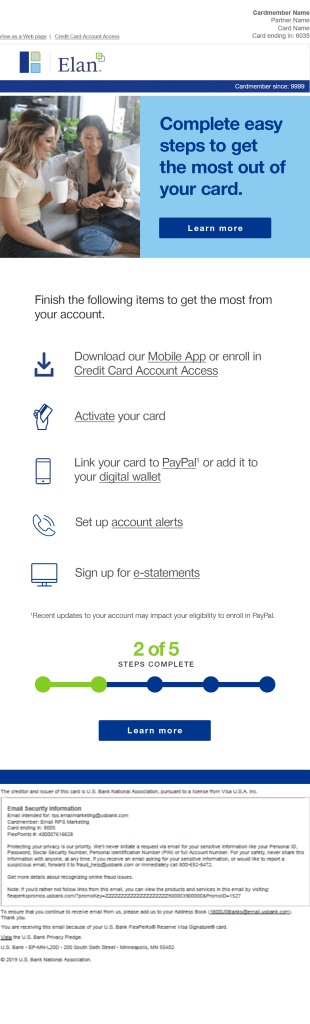
Checklist
This email was for customers at the beginning of the process. These customers had signed up for the account and received their physical card, but had not yet activated the card, enrolled in the program’s benefits and features, or set up the app.
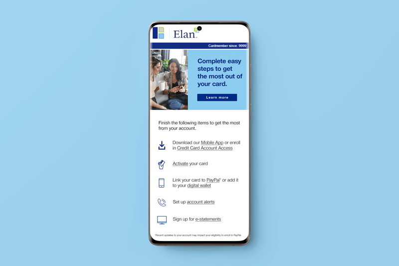
The email features CTA buttons, as well as a list of links for users to begin the different processes. Instead of a bulleted list, I used icons to support the message or action beside it.
In spite of having similar icon sets, I used different icons here to better target Elan’s audience.
Purchase Benefit
The purpose of this email is to remind new and existing customers about all the myriad benefits waiting for them. The first button gives them the opportunity to go to the rewards page to learn the details of the benefits. Then we outline the benefits of using the cards, highlighting the cashback percentages. Following that, there’s another button that takes users to the benefits program of their card.
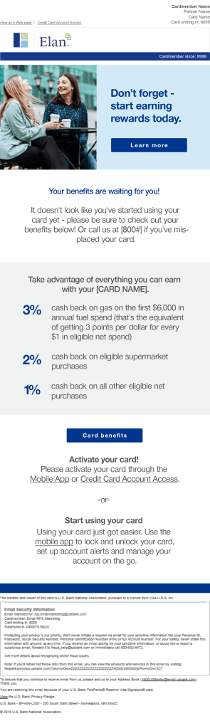

Since there’s a good chance that users who haven’t used their card yet are new customers, we also included easy access for users to activate their new cards and download the US Bank Mobile App.
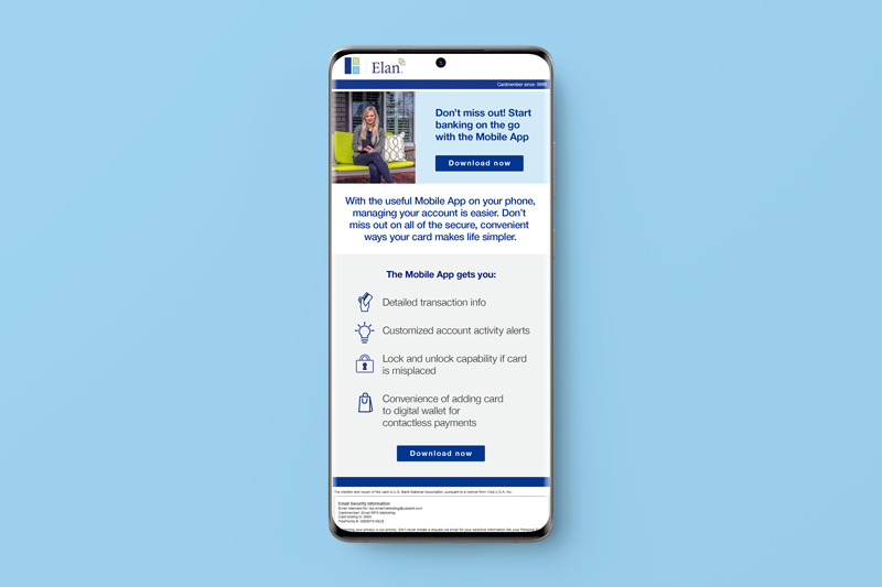
Online Banking Benefit
This purpose of this email was to spread awareness of the US Bank Mobile App and how easy it makes online banking. For those who didn’t already have the Mobile App, the message enticed the audience to download the app to make life simpler. For those who already had the Mobile App, the message advocated the benefits of using the app to make life simpler.
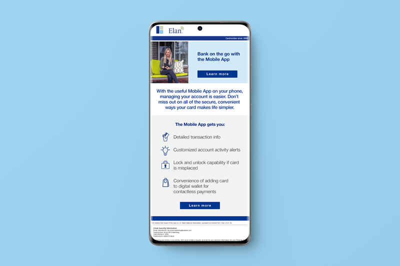
Treating the list similarly to the Checklist email, I paired the icon set with the messages to enhance user understanding.
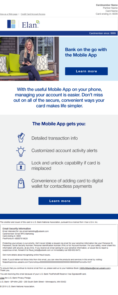
Elan needed 2 variations of this email, highlighting the benefits of the online banking program. One version is for customers who already have the Mobile App, directing them to visit it, and the other is for customers who have not yet downloaded the Mobile App, and it prompts them to download it with a call-to-action button. See the subtle variations in the emails below.