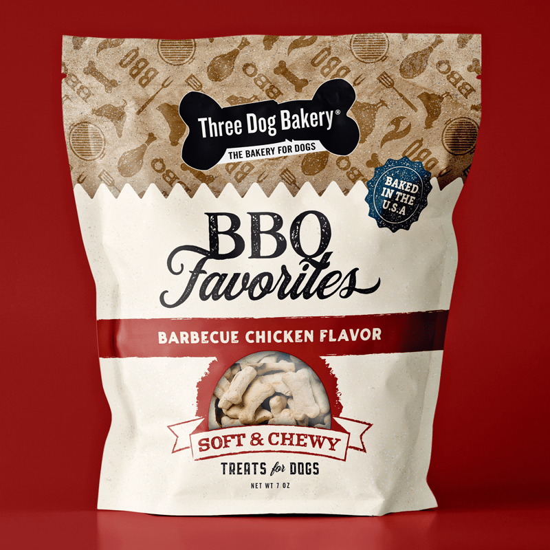
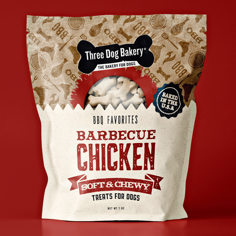
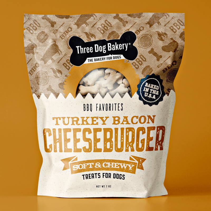
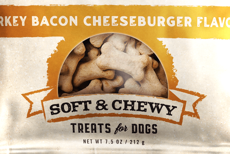
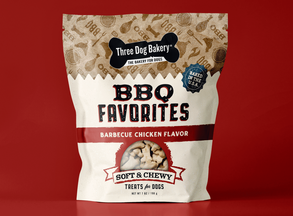
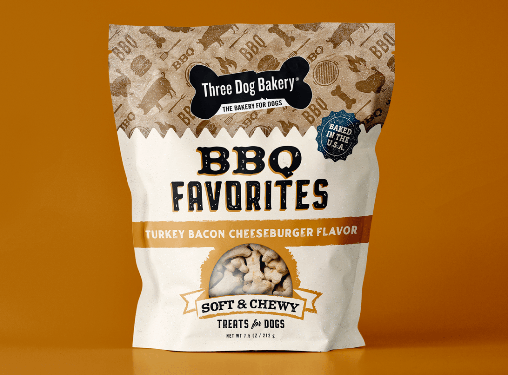
Three Dog Bakery creates dog treats using simple, real ingredients, and a slow baking process to create tasty and nutritional treats for dogs. They wanted to introduce two barbecue treats to their line for the spring, summer, and fall months, Barbecue Chicken Flavor and Turkey Bacon Cheeseburger Flavor, and needed packaging design for each flavor.
SERVICES
Packaging Design
Illustration

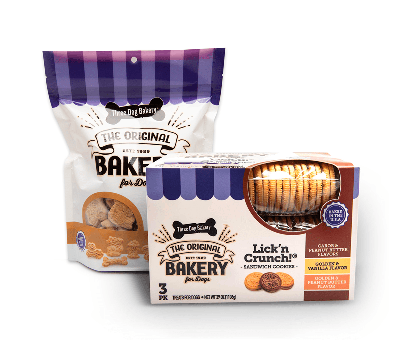
EXISTING PACKAGING
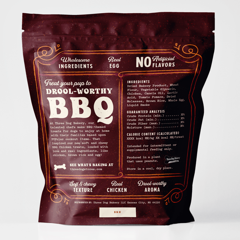
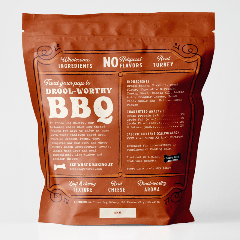
Although Three Dog Bakery’s existing packaging used an awning-like graphic across the top, they encouraged me to think outside their existing designs with these limited-time SKUs. For brand recognition, I chose the following details to encourage visual continuity between the existing packaging and the new packaging:
- Logo: same general size and placement
- Color: ivory/off-white color selected from brand palette
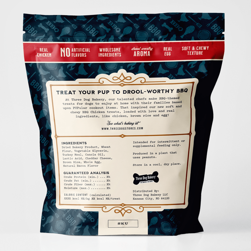
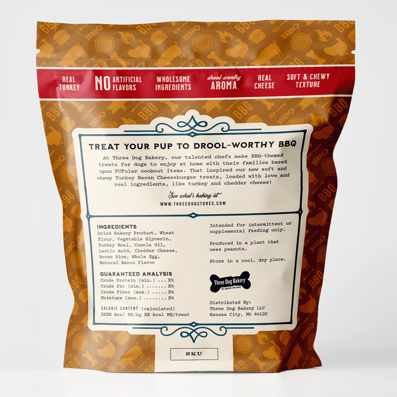
- Graphic: “Baked in the U.S.A.” graphic element
- Font: same body font (back)
I applied some texturizing to the ivory/off-white, as well as to the graphic element to make it appear like a stamp, to transform it into the barbecue theme.
Creative inspiration
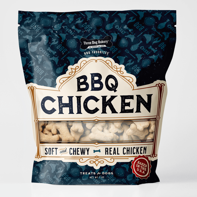
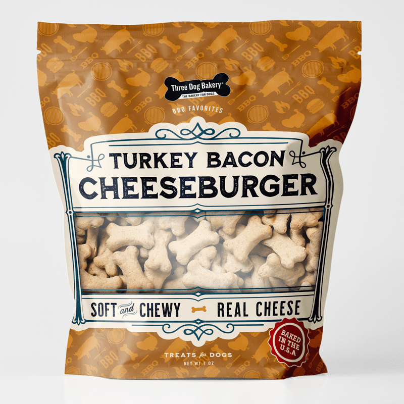
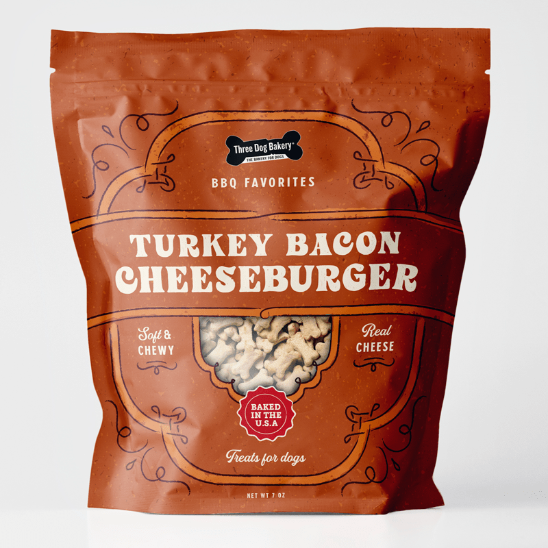
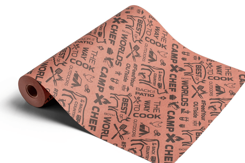
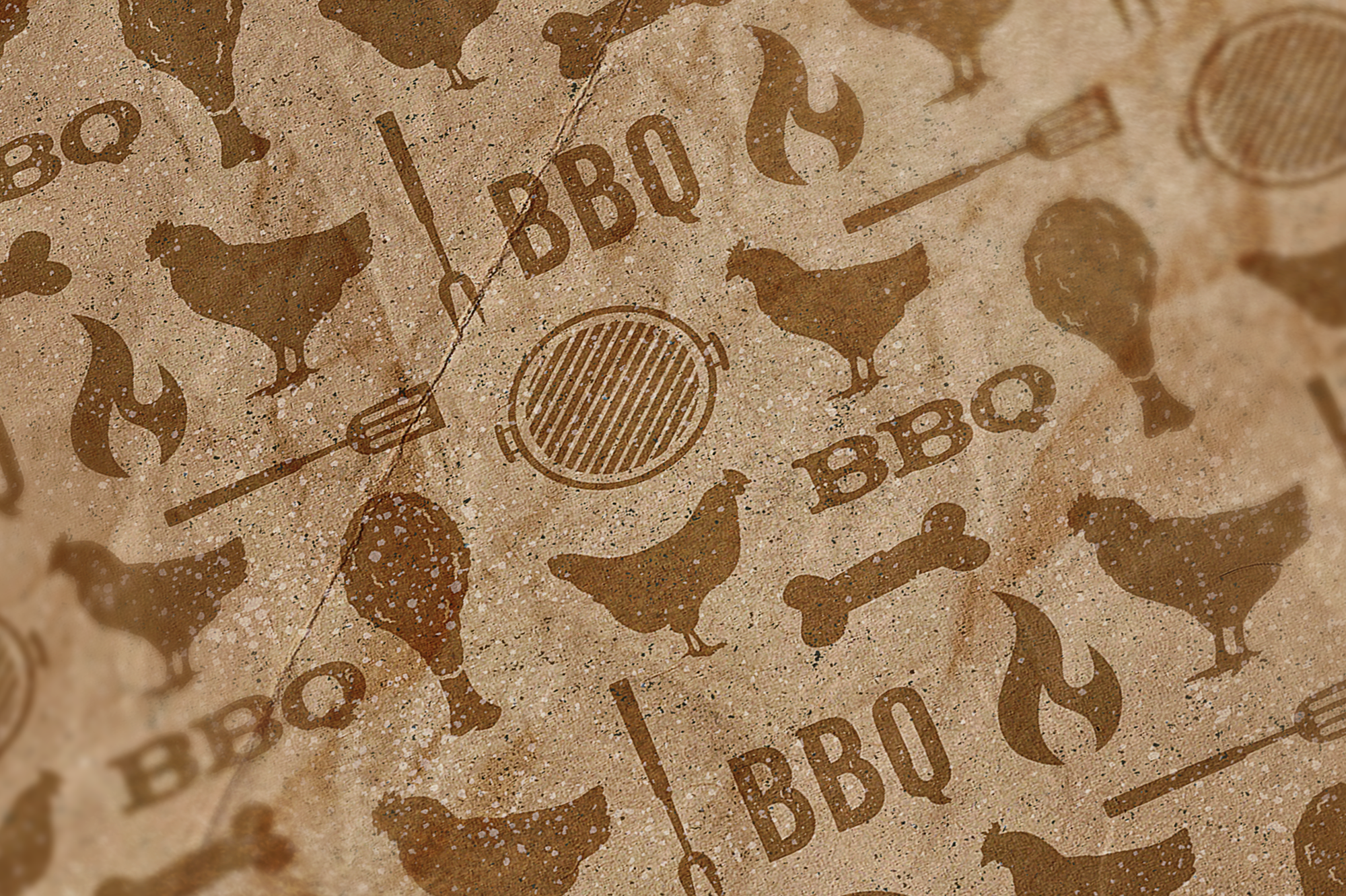
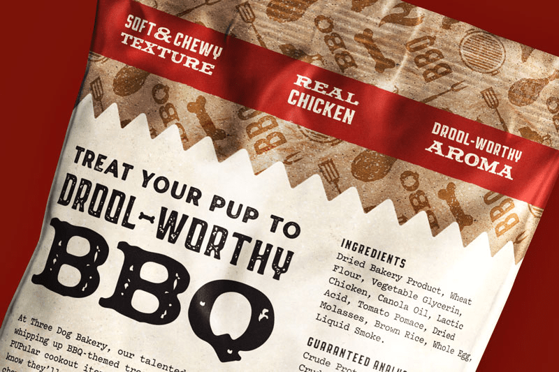
Collaborating with Three Dog Bakery, we came up with the idea to use the pattern style reminiscent of the prints sometimes found on the butcher paper and wax paper found in the baskets at barbecue joints. That way we could immediately provide some visual consistency across the two packages, while still tailoring each to its contents.
DESIGN
Beyond evoking the look and feel of a barbecue joint, we wanted to use the packaging to capture audience attention, be legible from a distance, communicate product information, and showcase the product via thoughtfully placed window.
In order to appeal to their target demographic, we needed to keep the same playful and friendly tone with the artwork, but move away from the cartoony illustrations of the previous packaging.
illustrated pattern
I created vector illustrations of chickens, barbecue implements, an open grill, flame, turkeys, and pigs and then added “BBQ” and Three Dogs Bakery’s bone icon to create repeating patterns for each of the flavors.
We used a brown tone-on-tone for the pattern to push it to the background and prevent it from overwhelming the design. With the texture and the angled application, it achieved the aesthetic we wanted, kept continuity between the two different items, yet allowed them to be tailored to each flavor.

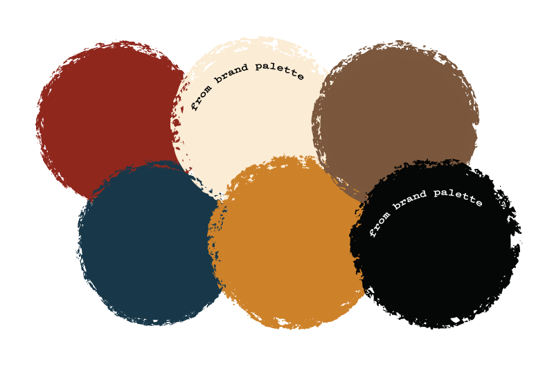
classic color palette
Starting with the base of the brand palette neutrals, we found a selection of classic red, blue, gold, and brown suited our vision.
playful letterpress typography
Keeping Three Dog Bakery’s monotype font, “Pitch Bold,” from brand fonts for the body copy, I used seven typefaces in classic letterpress styling. An assortment of script, monotype, sans and slab serifs, they were chosen to achieve the barbecue joint aesthetic, and generate excitement in an attractive and legible way.
graphic elements
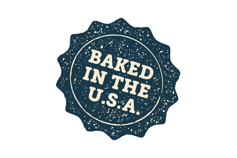
Altered the “Baked in the U.S.A.” lockup and gave it a textured effect to make it resemble a stamp. Chose the color to resemble a blue ribbon, to subtly suggest that this is a “winning product”.

Applied texture to ivory/off-white color and used a deckled edge to further suggest the idea of butcher paper, as well as inject a playful sense of movement.

Illustrated a simple, rustic-textured banner to emphasize text and create visual hierarchy. It further suggests “BBQ” as banners are often used in barbecue themes.
RESULT
Using color, texture, playful typography and illustration, we were able to produce a set of barbecue-themed packages that are sure to grab customer attention.


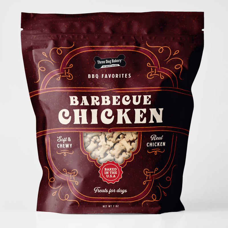
ALTERNATIVE OPTIONS
As with all creative challenges, there are many possible solutions. Here are some of the options that we passed over during our process.