Former Army staff sergeant Tyler Brown hired me to create a personal brand & logo for his travel blog and social media presence as he travels the country, climbing mountains, having adventures, living and working out of his custom van. He wanted the logo to include the name of his brand, blog, and social media accounts, The Dirtbag Digest.
SERVICES
Branding & Logo Design
I spent some time asking questions to better understand the nuances and attitudes of climbing culture and van life. The first thing I found out is that “dirtbag” is a familiar term in climbing culture vocabulary- it speaks to the idea of being all about the climb, the mountain itself, and the willingness of climbers to literally throw their sleeping bags down in the dirt.
Illustrating Mountains
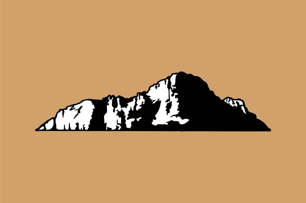
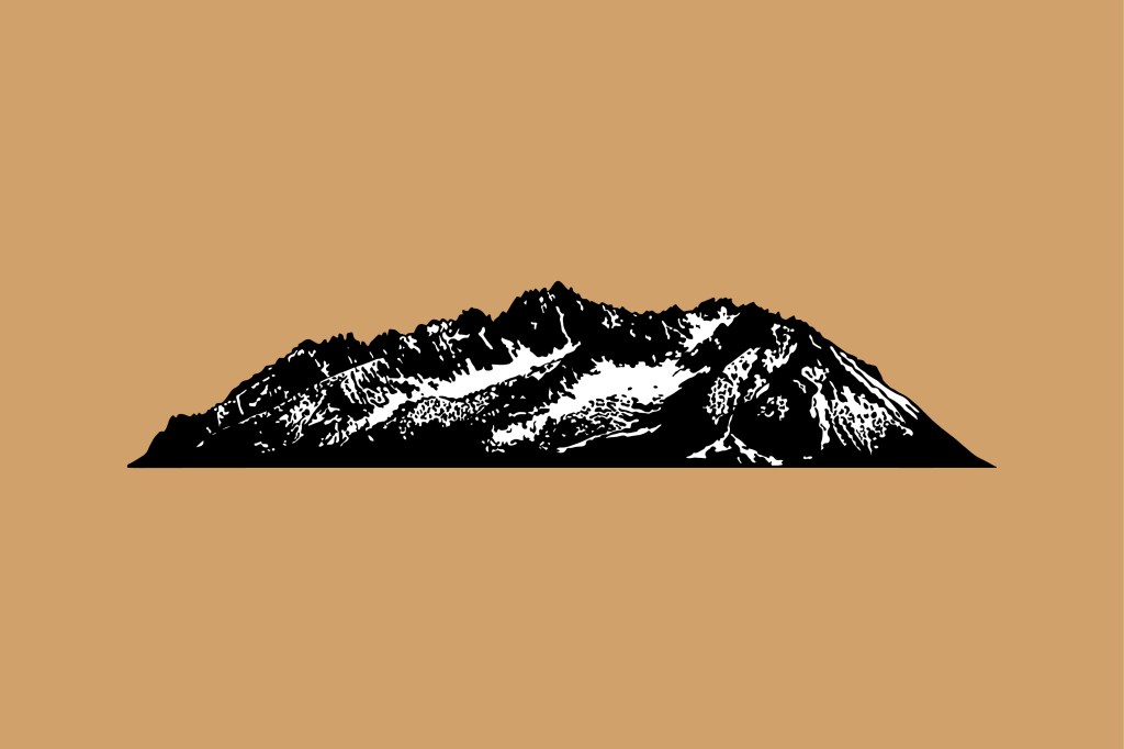
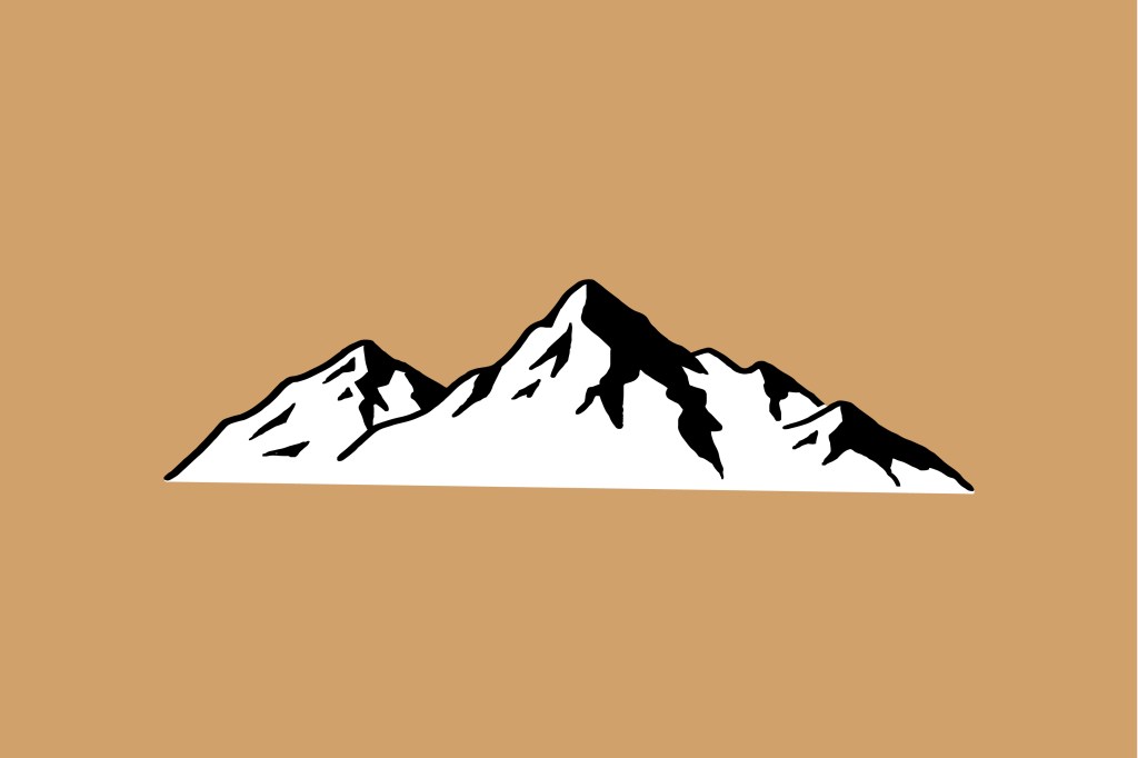
Tyler described himself as having a particular affinity for the Sawtooth Mountain range of Montana and Idaho, having lived and climbed there for years. Although his plans were to travel and climb other ranges, I wanted to try to give an option or two that was more representational of that particular range, since they meant the most to him. Using Procreate, I was able to draw some options based on photo representations of the range. I tried to go for different levels of detail and simplification with each option, so that we could find the best balance for the logo.
Initial Logo Options
I next designed a badge styled logo option utilizing each of the mountain ranges I’d drawn.
In Option 1, I used the shape of the range to layout the word “Dirtbag,” allowing a few pieces of the script to sink just behind the range. I used a badge shape that vaguely represented the same shape of the range, so that they and the text could fit nicely inside. I liked the idea of breaking the boundary on one side (with the D), and would have done some further explorations with line breaks and shading had the client chosen this option.
With Option 2, the mountain range still had a lot of detail and complexity, so I thought it needed to be used more simply. I styled it with a more subtle contrast with the background, scaled up the size and cropped it within the badge, and laid the typography over the top.
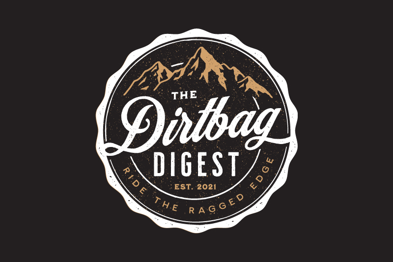
Option 3 uses the most simple version of the mountains, which I put in over the text along with a tagline I thought might underscore what this brand was all about. This option ended up being Tyler’s favorite, however this tagline inspired him to give me a more significant and meaningful tagline to use, “Ride the ragged edge”.
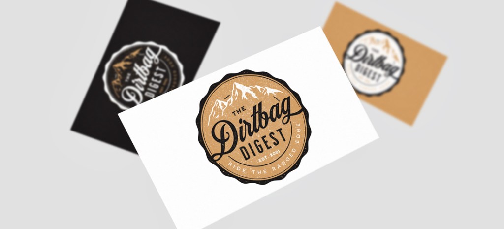
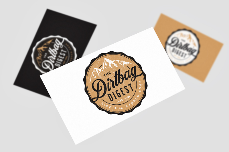
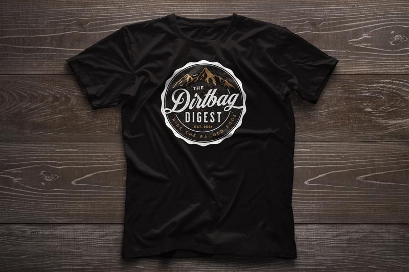
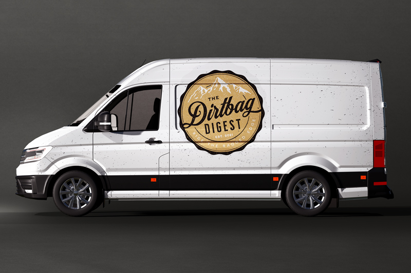
Final Design
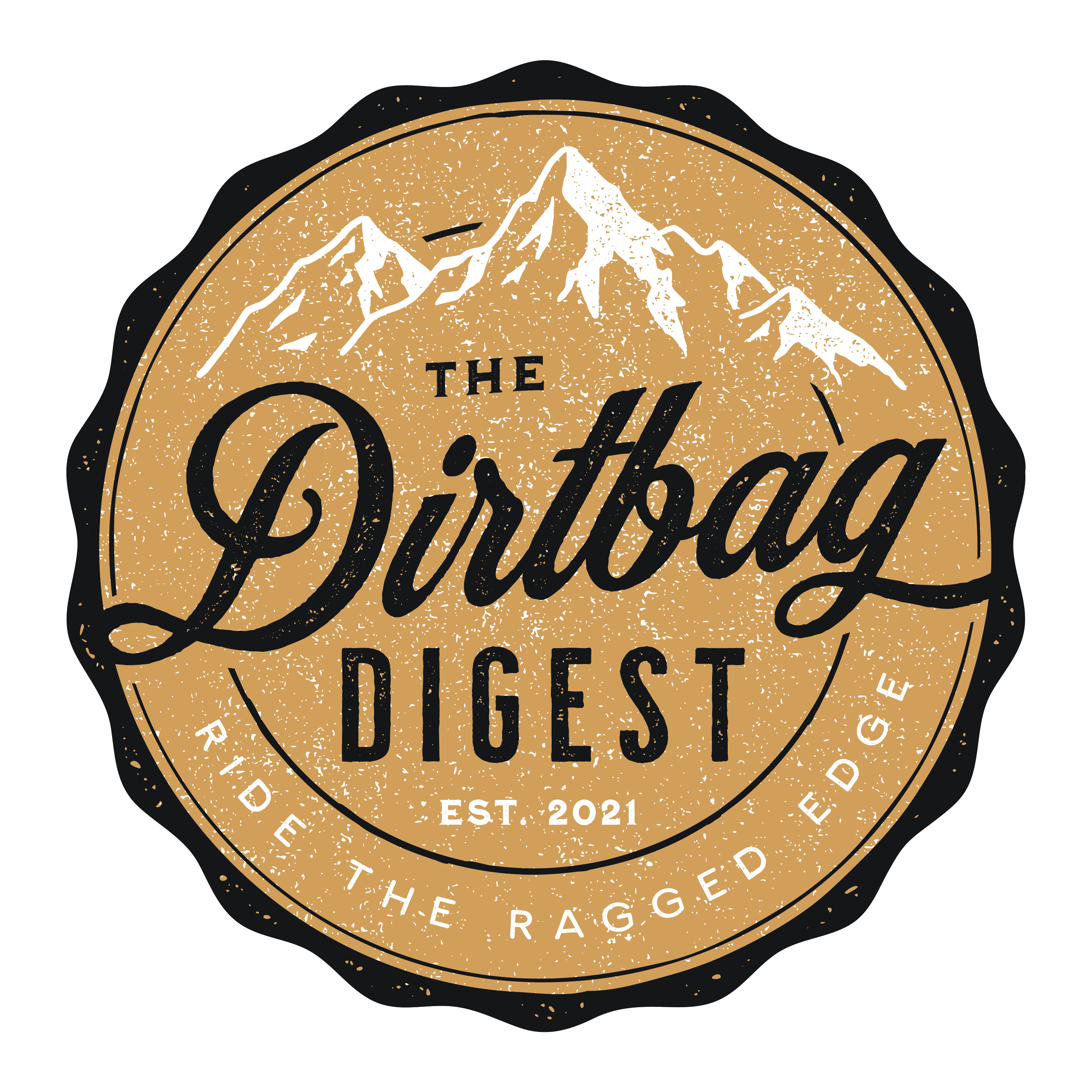
With the change of the tagline, I was able to rework the top of the badge and bring the mountains in larger. I debated whether or not to leave the secondary inner white circle on the top part of the badge, but it looked more cohesive to leave it in and let it peak through behind the mountains.
Collateral & Logo Guide

Scratchboard
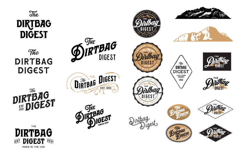
Different typeface, layout, and logo options that didn’t make the cut.