Q39 is one of Kansas City’s fastest growing barbeque joints. Their award-winning food is made from scratch with fresh ingredients, and their original sauces are in high demand. They needed a secondary package – a box versatile enough to contain any combination of their sauces and dry rubs – to enable direct product sales to satisfied customers, and provide gift options for fans.
SERVICES
Packaging Design
Photo Manipulation
Advertising
Digital Design
Print Design
Package Design
Challenge
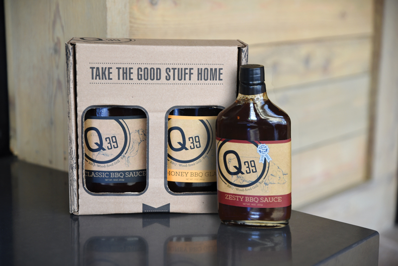
The client had already purchased a pre-cut brown cardboard box with two cut windows to feature the products inside, so first we obtained the die lines for the box. They also had a limited budget, and asked that we keep the print design restricted to black ink only, and printing on the outside of the box only. The box didn’t need a SKU, but it did need to include contact information for Q39 and their branding. Later in the year they asked us to create a dedicated holiday-themed advertisement for their To-Go boxes.
Design
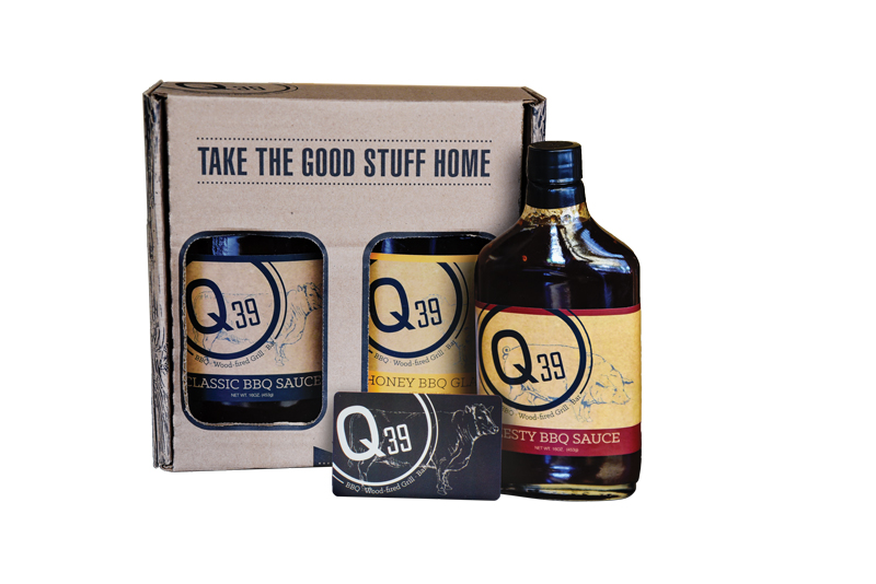
The outside of the box features a combination of 2 sauces or rubs, along with the message “Take the Good Stuff Home”. This message encourages people to purchase the products while showcasing the branding and product. Cow and pig diagrams (representing the two most popular barbecue meats) each wrap the sides alongside ribbons with website and contact information for the restaurant, as well as a catering contact number.
Since the logo would be featured on the sauce and rub products and be visible through the window, placing the Q39 logo on the front of the package would have been overkill, so I placed it on the top of the package so it could be seen from above. The bottom, where the package opens, features a wrapping ribbon that reads “KC’s Best Barbecue” “Made from Scratch” to highlight some of their selling points.
I also included a bit of a peek-a-boo effect with the faux bois [wood] print. You can see just enough of it from the front when the package is closed to know what it is, and when you open the package is has an impact and gives a taste of the restaurant’s aesthetic. When open, the bottom/front panel of the package has a message encouraging customers to view menus, make reservations, or browse catering options, and again showcases the URL.
The fonts used in this package were primarily from the existing branding, I added one condensed/tall typeface to fit into the family.
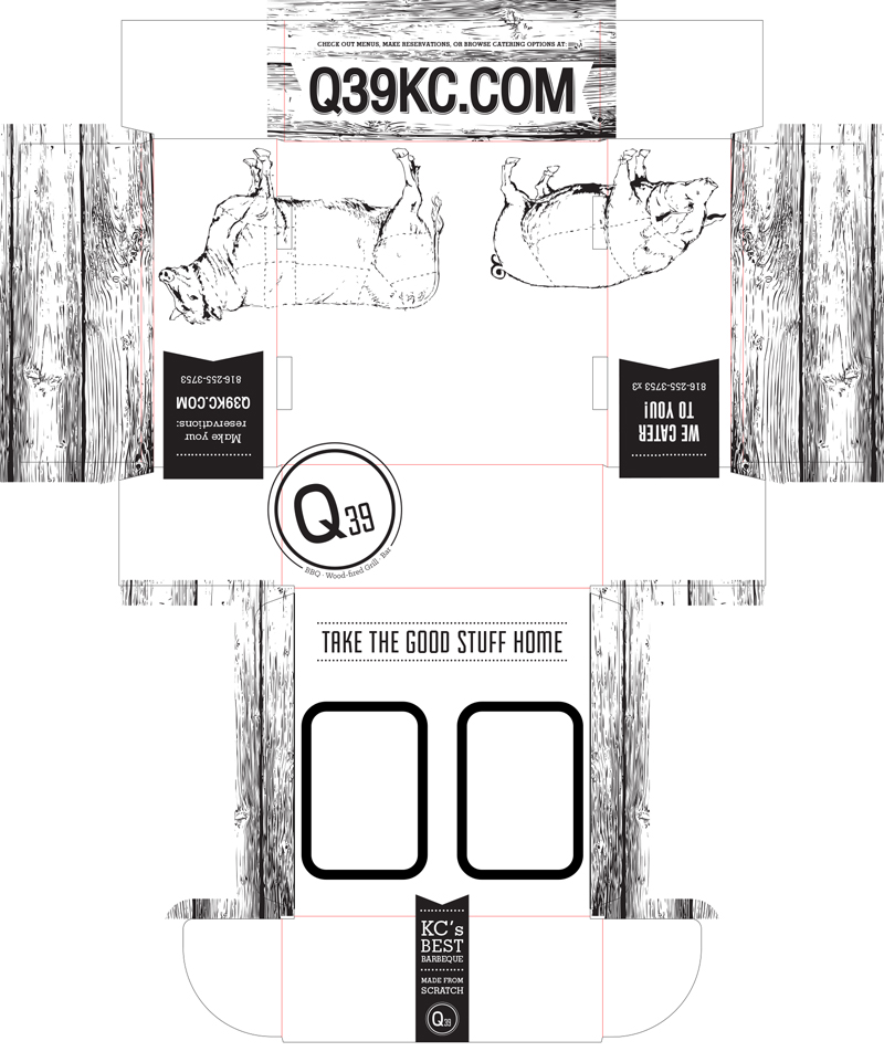
Photo Manipulation
Challenge
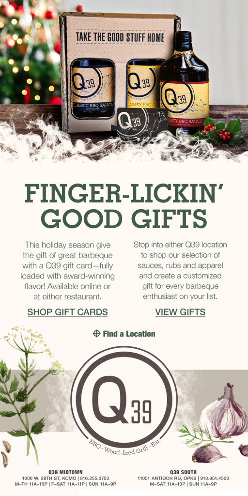
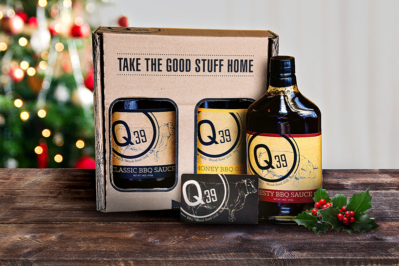
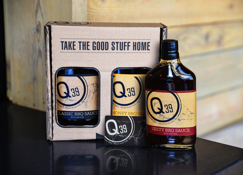
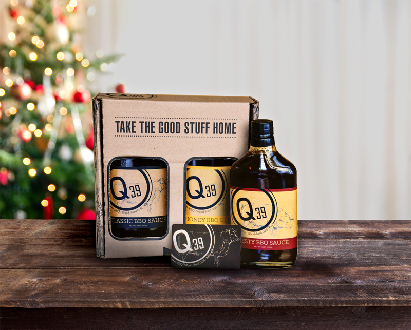
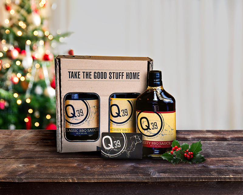
Q39 wanted a unique holiday ad for print and digital purposes, but they did not have the budget to facilitate a photoshoot, so we got creative with Photoshop. To create the ad, I started with this image of the packaging and a sauce bottle on the countertop at one of the restaurant locations. After color correcting, I cut out the objects from the background (COB) and then photoshopped in a gift card at a realistic scale, casting a realistic shadow on the packaging behind it.
Next, I put the image in a holiday setting, which was a purchased stock image. I added shadows to ground the objects as well as feature them as if there was a spotlight on them. Then, I added a touch of holly to pull the holiday theme through to the foreground, and accent the negative space in the photo setup. Last, I increased the mid-tone contrast and added a high pass sharpening filter to give the image a bit more of a punch.
Advertising
In addition to selling the packaging from restaurant locations and online, this packaging design was featured in their holiday advertising, both in print and digital ads, as well as dedicated emails.