This project was a small campaign for Park University, a private liberal arts university in Parkville, Missouri, founded in 1875. We were tasked with coming up with a campaign that would entice traditional and non-traditional students alike. We were asked not to use photos of students, coming off the heels of a year-long campaign that featured them.
Concepting
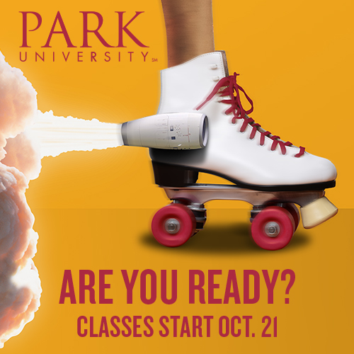
The creative director at Walz Tetrick and myself concepted together, discussing ways of visually representing the idea of being “boosted” or “propelled forward” in life by the education and credentials a student gains from Park University, and landed on the idea of a “rocket skate”. The visual of being on wheels and being propelled forward by jet or rocket engines gives the viewer the idea of a clear advantage.

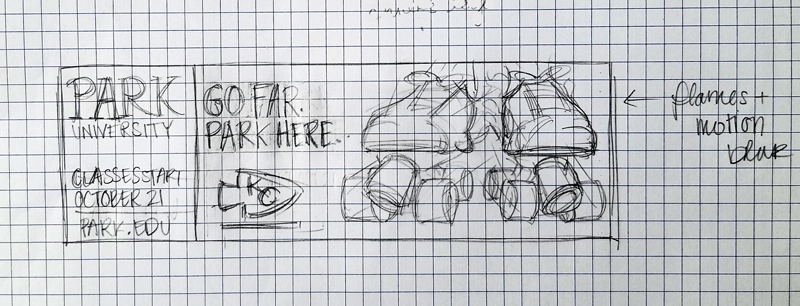
I sketched out ideas and compositions of how I wanted it to look, but when I combed the stock imagery sources for images of skates (with ankle), rockets, rocket streams, and jets, I found myself very limited on sizes and angles, so I tweaked my concept to accommodate.
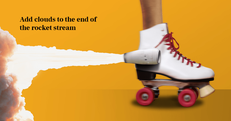
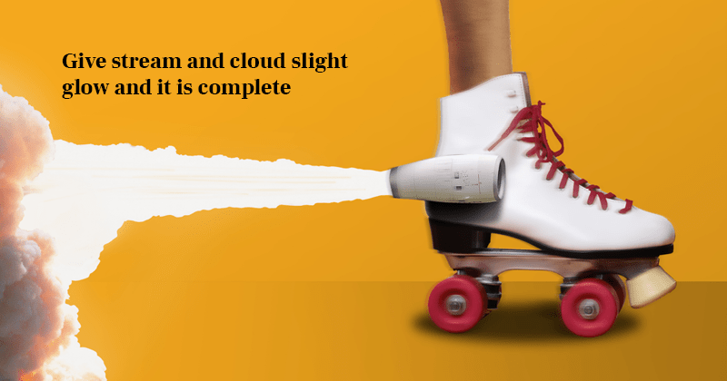
Skate Build
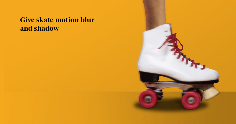
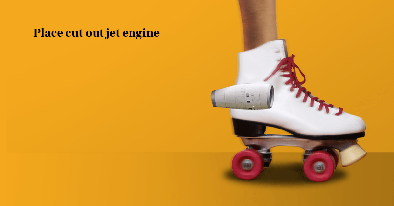
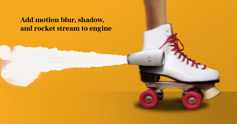
Once I found a good image of a foot in a skate, I cut out the image from it’s background, and changed the color of the skate laces and wheels to match Park University’s brand red. I similarly cut out a jet engine, and a rocket stream and cloud. Then I proceeded to combine them and create shadows, highlights, and motion blurs as shown in the steps below:


Billboard
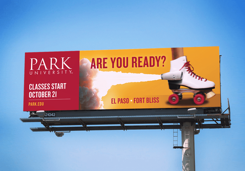
The first utilization of this concept was the billboards for the Kansas City metro and the El Paso, TX area. The jet stream left a nice area for text to overlay and the clean background made the billboard both branded and easy to read from the highway. The bright colors popped nicely against the sky and the university logo was prominent. The typeface was chosen from the general brand campaign for continuity.
Print Ad
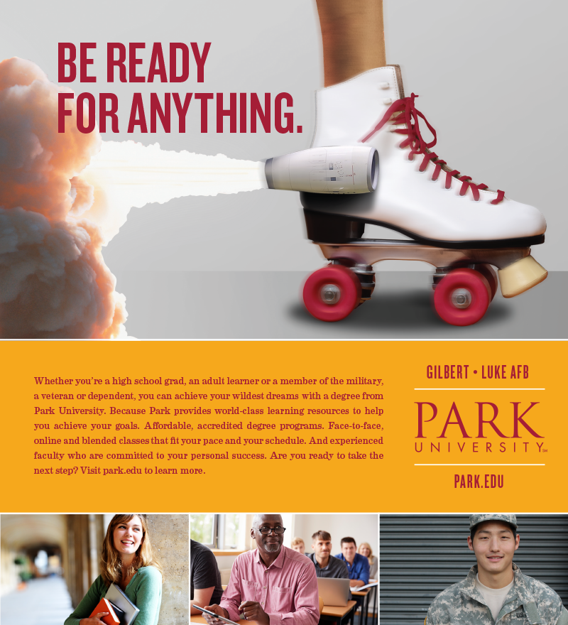
The next asset was a magazine ad for publications circulating in the Phoenix, Arizona area, near two of Park University’s many satellite campuses. This ad targeted all three of their main student groups, the traditional student, the non-traditional/continuing education student, and the military student (as shown in the bottom of the ad). Special attention was given when selecting these images from stock sources; not only was it important to represent age, gender, and racial diversity in the students, but the military uniform had to be both non-specific in terms of branch (Army, Navy, Air Force, Marines, etc.), and also be a correct fatigue pattern and print for a member of the United States military.
Static Pandora Ad
Finally, I generated a static and an animated digital ad for Pandora radio. The static ad image features the skate with a shortened jet stream and broader cloud to fit the composition, leaving space for both the headline and the logo to be easily read.
Animated Pandora Ad
For the animated ad, I wanted the skate to actually propel itself across the screen, so I found a video of a rocket taking off. In Adobe After Effects, I was able to mask the rocket leaving just the stream, then place it behind the skate and propel the skate across the screen. It looked awesome.
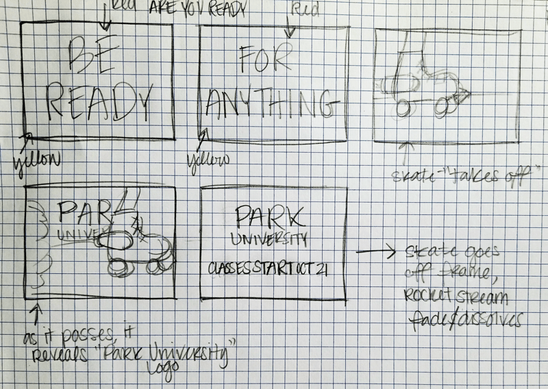
Unfortunately, I then discovered that the file size requirements for the Pandora radio animated ads were so low, I was going to have to restrict the colors on the output. It still achieved the excitement and attention-grabbing qualities of a motion graphic ad, but I wished it could have been full color.

