While working as a Graphic Designer for Fashion Forms (2012-2014), a specialty lingerie creator/distributor based in Ventura, California, my main task was to manage over 25 packaging lines, each with 25-50+ different items. When Macy’s wanted to refresh their packaging design, we saw an opportunity to create a more durable package with clear and sophisticated colors and lines.
Old/Existing Packaging
The packaging that Macy’s had on their shelves used a retro script font that was trend-based, and as time wore on, had become very outdated looking as a result. Big pink scallops and clunky retro script might be eye-catching, but lacked the feminine sophistication that we wanted to portray at the Macy’s/department store price point.
We asked the client to share the problems they currently had with their packaging, and the top complaints were: customers didn’t understand what the items were, which resulted in a high volume of repeated openings of the package, that caused a lot of wear and damage to the packaging.
Interesting Challenge
Our company’s CEO had personal views that the belly button/navel was “obscene” to show, so an additional constraint was to come up with a creative way to omit the belly button (subtly, so as not to call attention to it) while featuring our products.
Solution
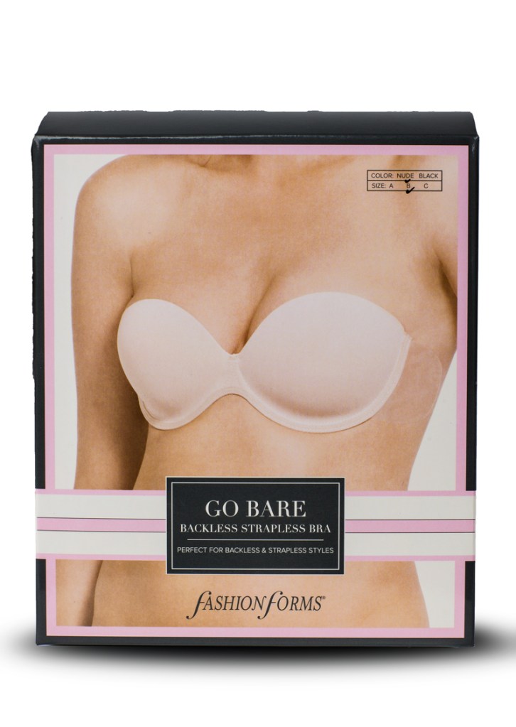
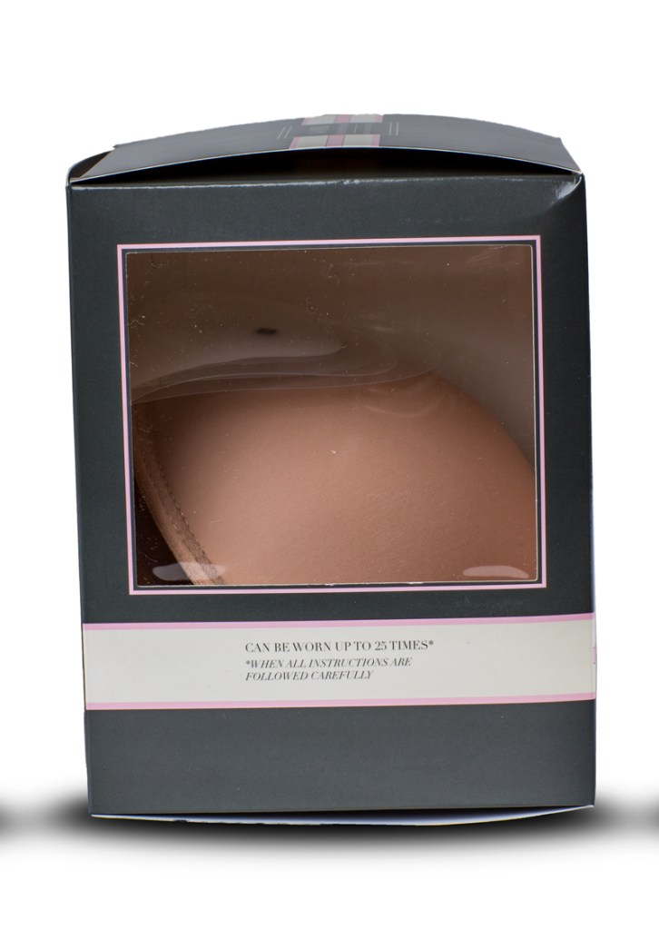
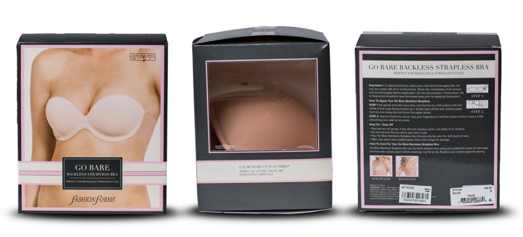
Starting with the templates/die lines of the packaging itself, I re-invented the boxes, adding windows to the packages so that the customer would be able to see the product without opening the package. While making these changes, I was in contact with the printer overseas in China, and based on their direction, I had to engineer the packaging to be machine or line-assembled, as well as print and cut from a single piece. Some of the packages required an additional insert so that the product would sit or hang correctly inside the box. This was a fun challenge for me, and it also taught me a lot about print and production process.
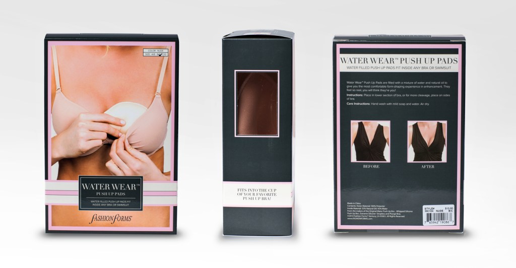
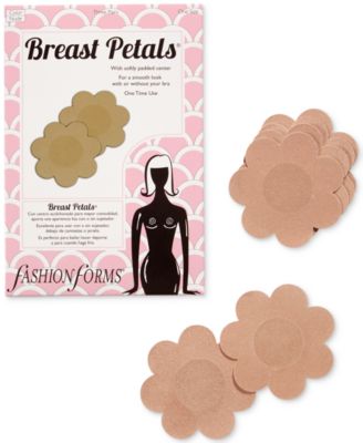
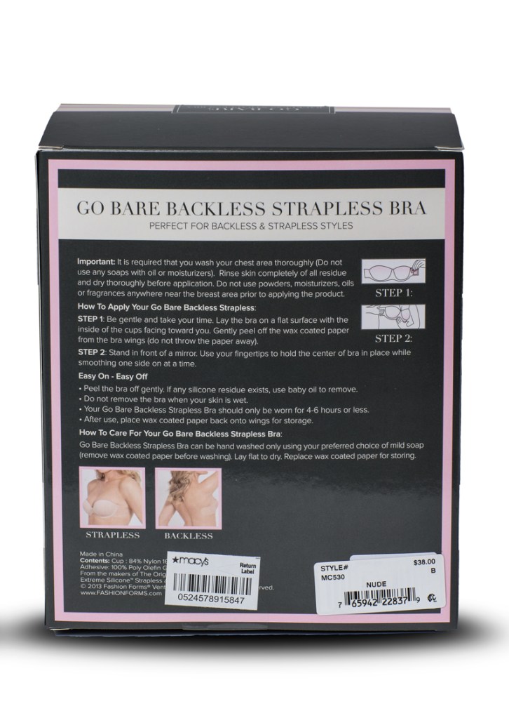
Another way I helped the customer to understand the product was to replace the stylized illustrations with full color photos of the products on model. By featuring these photos, the customer is able to see in a glance both what the product is, and how it should look when worn. They might then be able to see the color/texture/quality of the product by looking in the window, and not have a need to open the package. This required some dedicated photoshoots and a lot of photo retouching, but eventually we processed our whole library of products in high resolution studio shots on model, so that every package we designed would be able to feature these photos. Additionally, I included some illustrated diagrams on the instructions portions to help the customer use the product correctly.
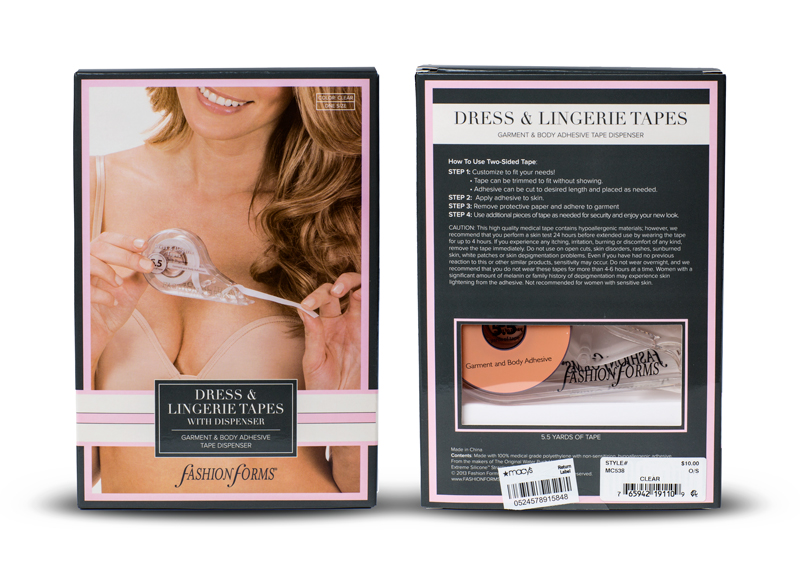
I chose a didone font and paired it with a sans-serif, which I felt was clean easy to read, chic, and perfect for the fashion industry. The ivory, pink, and grey color palette gave the design a clean but feminine feel. And finally, when sourcing materials for the boxes themselves, we had our factories overseas use a heavier stock for the packaging, with a nice gloss finish to help protect it from wear and tear. Stores reported that the packaging update held up better than the previous version and the windows worked to prevent people from tearing the packaging.
