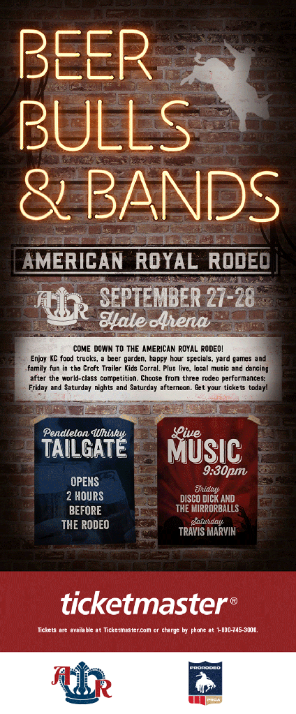
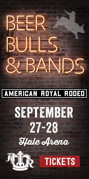
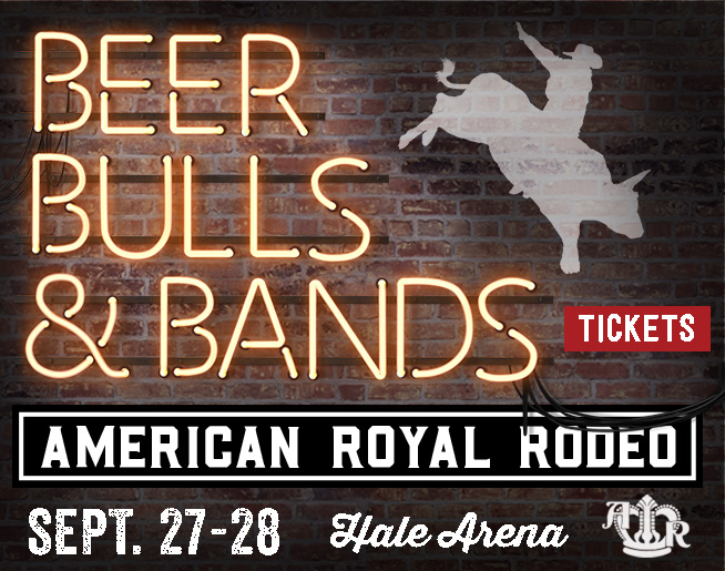
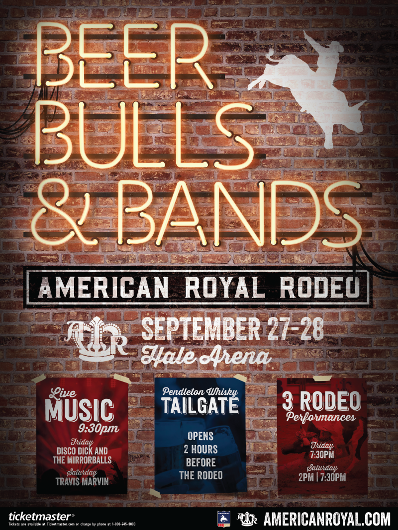
While at Walz Tetrick Advertising, I worked with a writer to develop this advertising campaign for the American Royal ProRodeo. With the 2019 campaign, we wanted to reach a broader audience than usually attended the annual rodeo. So we decided to play up the party atmosphere of the event, and emphasize the non-rodeo aspects of the event as much as the rodeo itself. We came up with the headline, “Beer, Bulls & Bands”, and went with a conceptual/stylized approach on the artwork to make the event portray, “party”, “fun”, and “nightlife”.
Inspiration

As I thought of ways to visually represent this aesthetic, I was inspired by a previous visit to Nashville, TN. Nashville has a bright and thriving music and nightlife scene, dominated by country western style music and fashion. Walking down the main strip, seeing the lights, flashing signs, and hearing the music; the party atmosphere seemed to be pouring from the open doors of each bar. I wanted to reference this vibe in my work, so I decided to pursue neon signs.
Neon Sign Solution
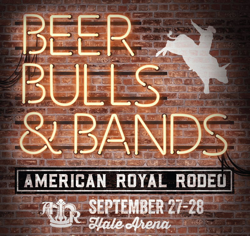
To create this scene, I combined images of brick walls, bracketing, tubes, screws, lit bulbs, unlit bulbs, paint, and shadow in Photoshop.
Billboards
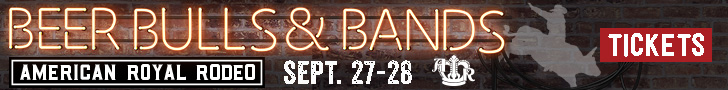
The concept first appeared on digital billboards around town, so we were able to oscillate our advertising over four different billboards, each with a different headline to emphasize different aspects of the event. We shortened “Beer, Bulls & Bands” to “Bulls & Bands”, created one that said “Broncs & Beers”, one that read “Live Music Live Action”, and one read “Cowboys & Cocktails”. Each of these headlines combines one rodeo word (“Bulls”, “Broncs”, “Action”, “Cowboys”) with one non-rodeo word (“Bands”, “Beers”, “Music”, “Cocktails”), so we felt we thoroughly conveyed that there’s more to the American Royal ProRodeo than the ProRodeo.
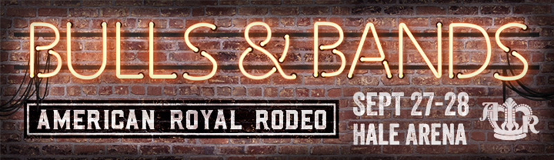
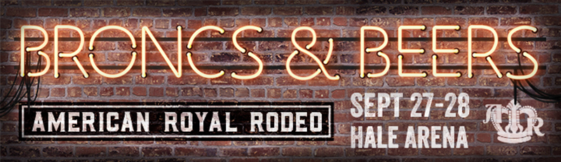
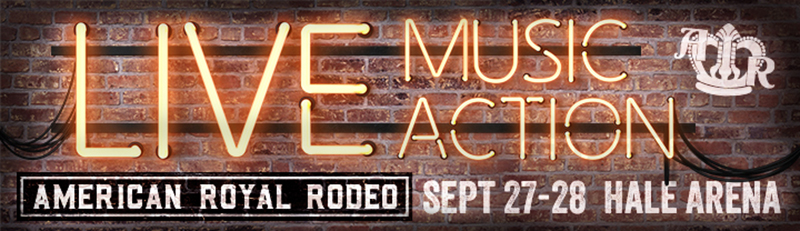
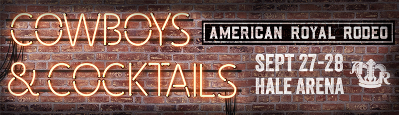
Because the headlines were created from elements rather than a font, each billboard had to be individually built in photoshop, but the same fonts and neon sign graphics were used in each, so the campaign remains visually continuous despite the different headlines.
Digital Ads
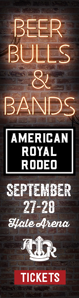
The client needed digital ads in a whole run of sizes, so the compositions were tweaked to create these small digital ads which appeared on a variety of websites.
Posters
Our client had some places they wanted to put up paper posters to advertise for this event, and they wanted the posters in both English and Spanish languages, to better serve the ad’s target audiences.
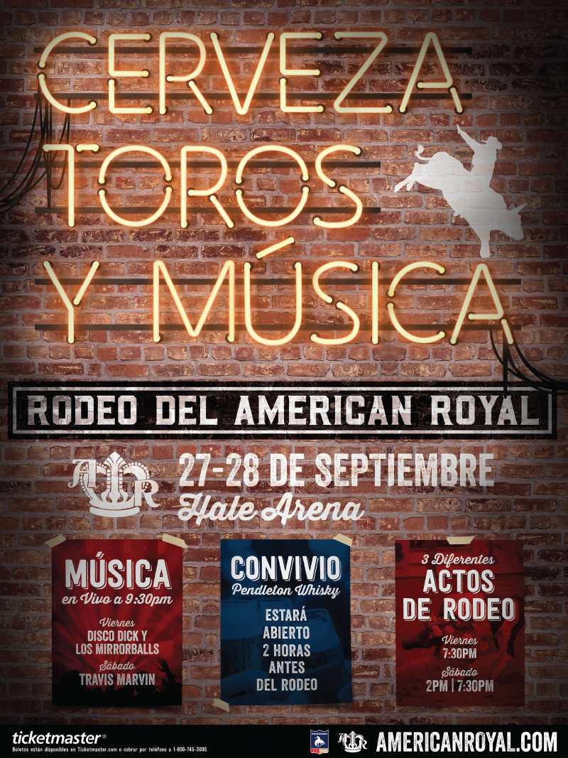
Due to the differences in word sizes from the English translation to the Spanish, when building the Spanish version, I had to tweak the composition slightly to accommodate. Again, the same graphics, colors, and typefaces were used, so the visual continuity remained unbroken.
Animated Email
The last asset for this advertising campaign was an email. I wanted to do something to give this a little extra punch in the inbox, so I opted to animate the neon sign for this asset. I made the sign turn on and then give a little flicker to the neon, each action also changing the ambient darkness I put this together and animated it as a basic .gif using Photoshop.