Ad Astra, a higher education partner that helps improve stewardship of instructional resources, streamline student access to courses, and accelerate student completions.
SERVICES
Presentation Template Design
Branding
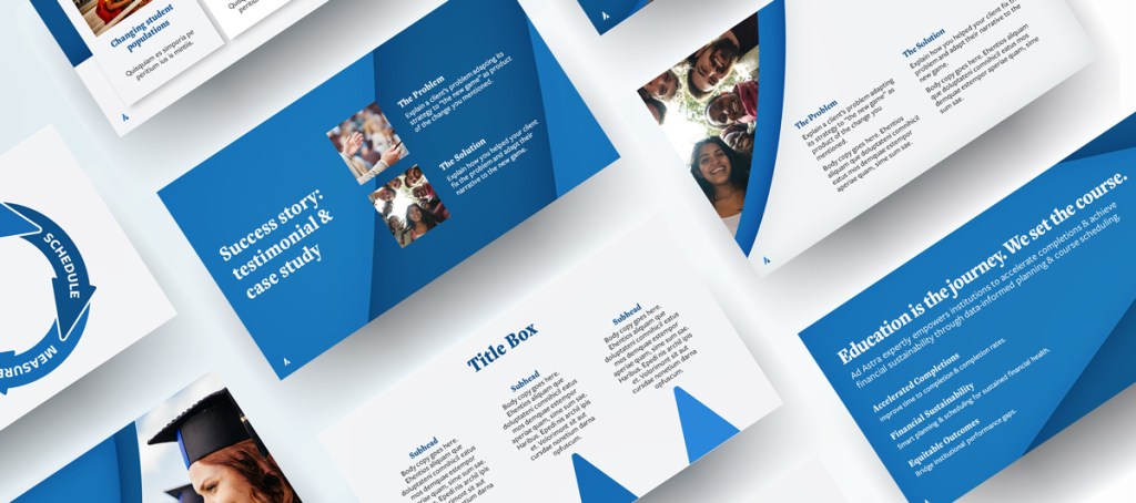
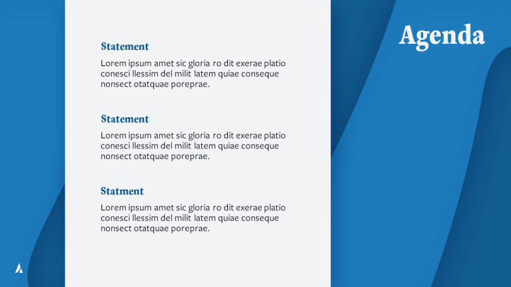
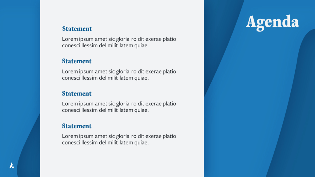
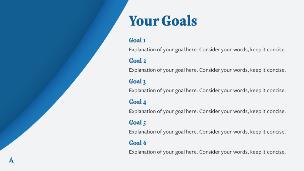
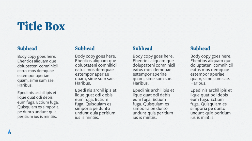
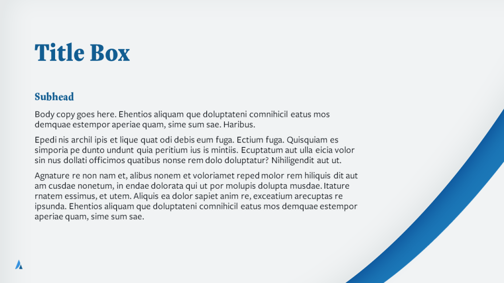
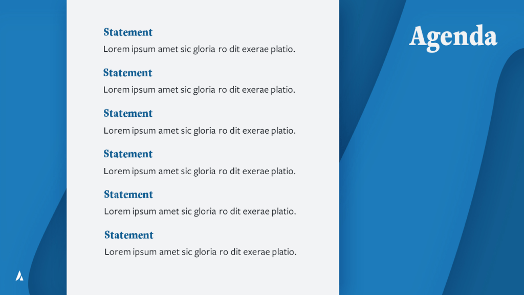
The purpose of this template was to ensure that all Ad Astra associates could put together cohesive, branded decks with autonomy, while still maintaining the visual brand standards and keeping continuity with other company materials. I used Microsoft PowerPoint’s Master Slide feature to create a template for PowerPoint decks, establishing the brand fonts and the brand colors by creating a custom Theme for Ad Astra.
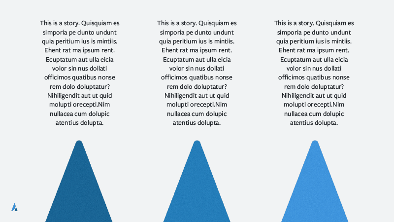
Background Graphics
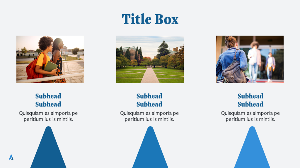
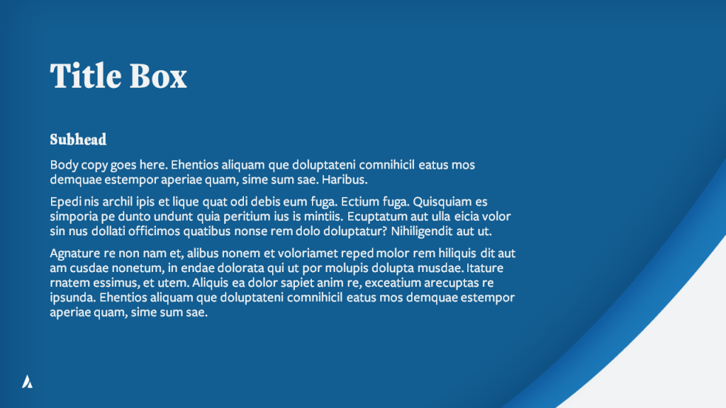
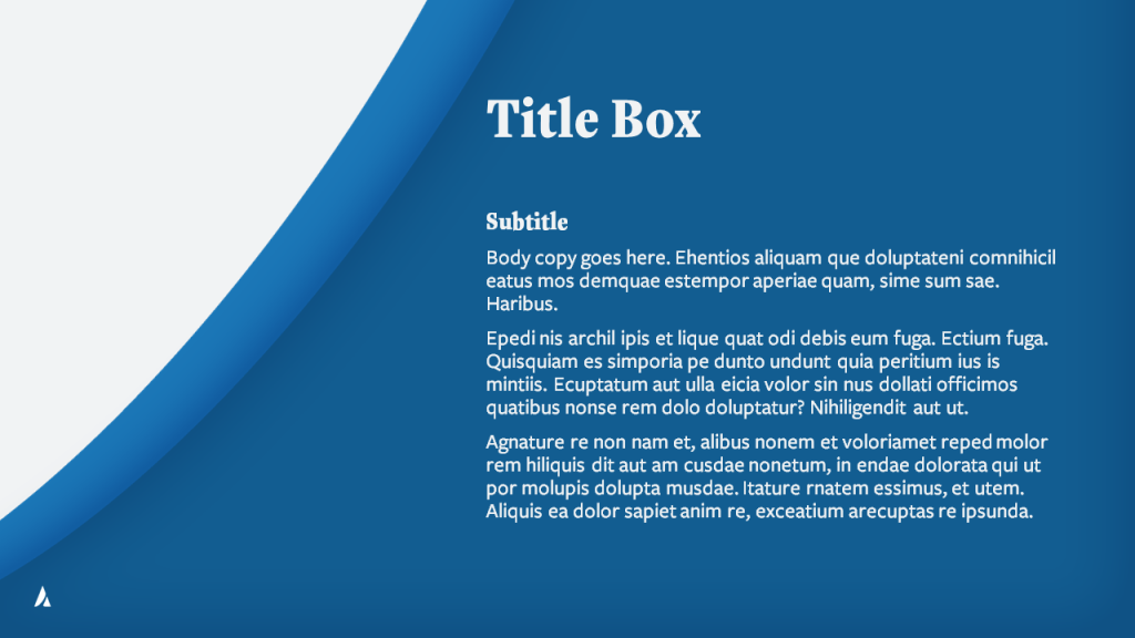
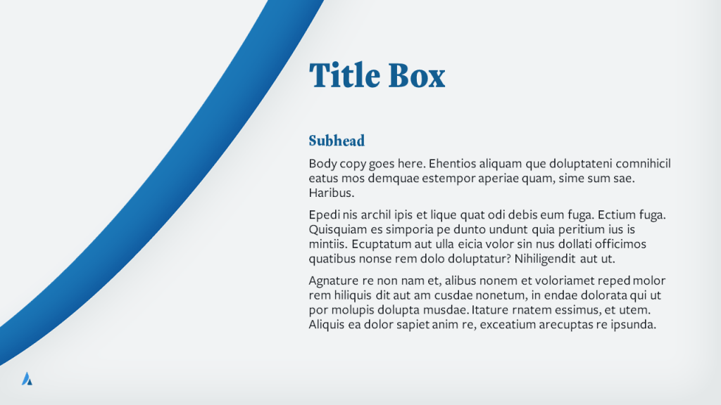
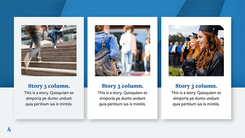
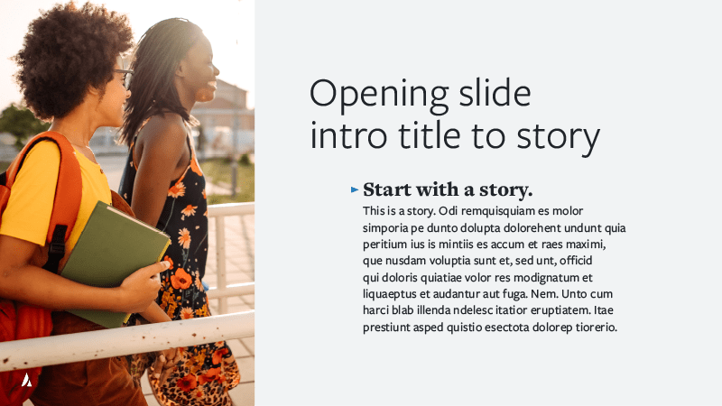
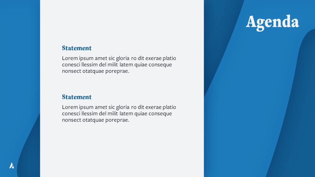
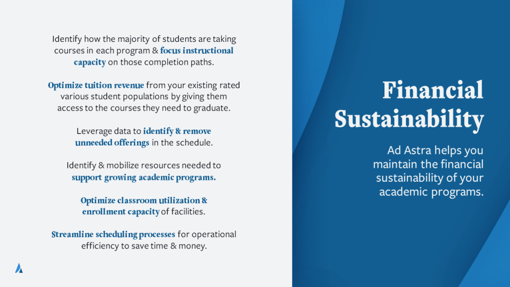
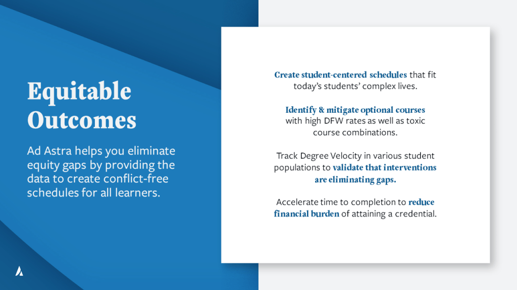
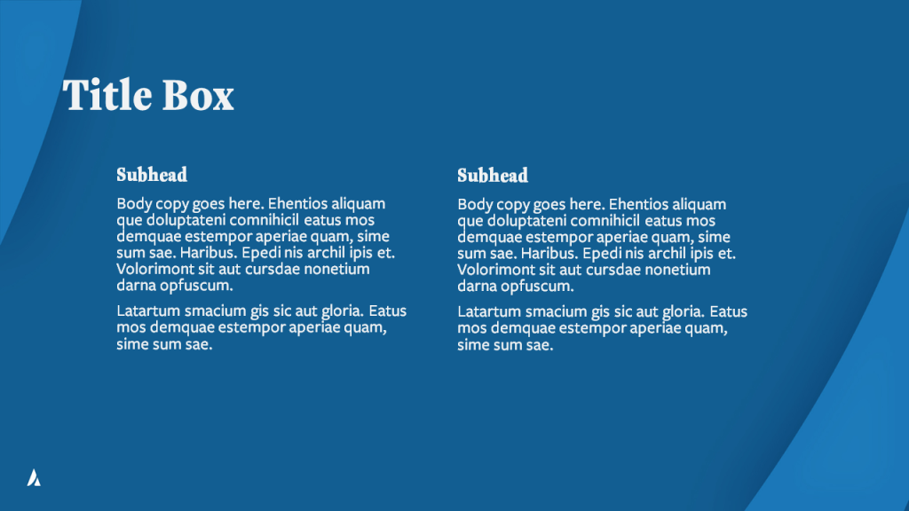
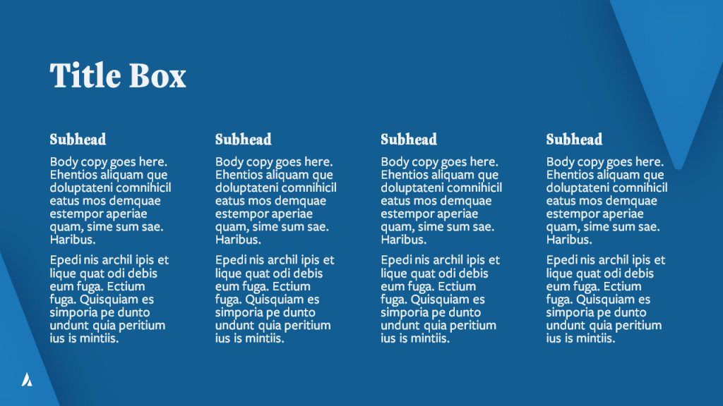
After talking with the client, I discovered they liked to stay away from illustrations and cutesy icon sets that might date them, preferring the authenticity of photography. However, we agreed they needed some more graphic elements to keep their presentation from being too plain and uninteresting. My solution was to create abstract backgrounds out of the shapes from the Ad Astra icon in their logo – the angles of the triangle, the swoop of the path. I experimented with subtle gradients and shading until I found the right balance.


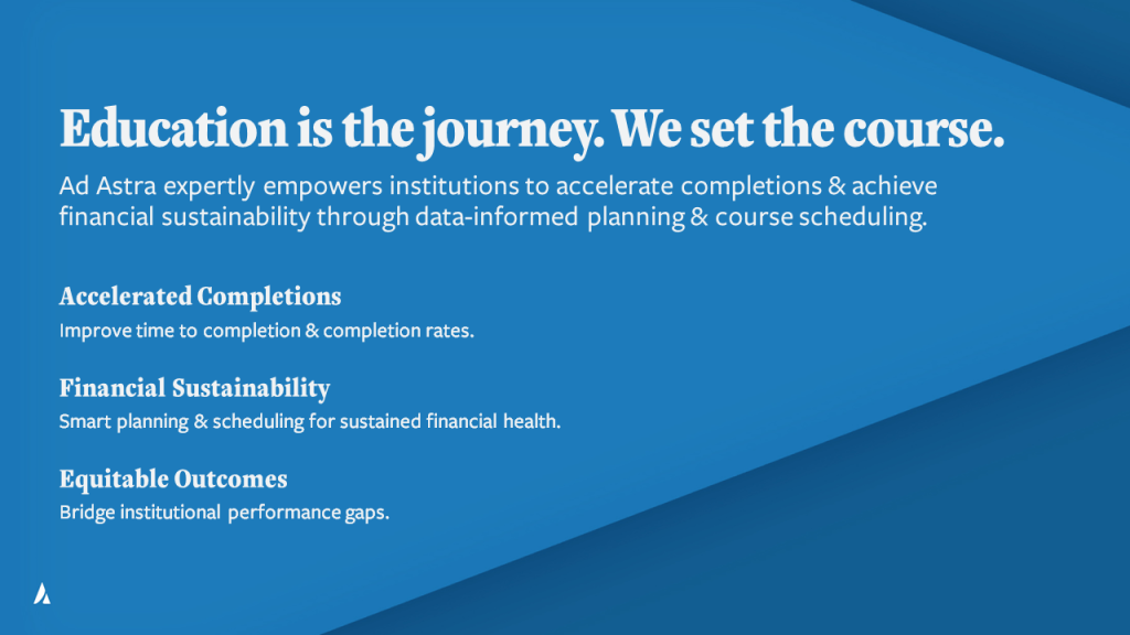
These backgrounds, in the brand color scheme, walked the balance of providing visual interest and subtle nods to branding while maintaining easy readability for text on top. I stayed away from reflecting path over either axis, preferring it to swoop up and to the right for brand recognition and the subtle idea of an “upward trajectory” to represent Ad Astra’s mission.
Circle Graphic

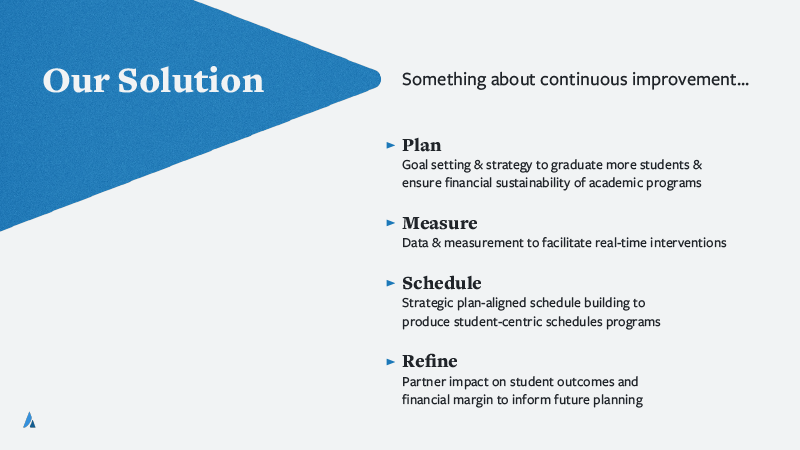
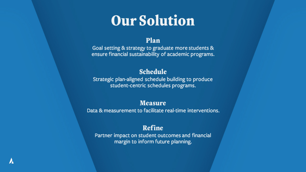
The client also requested a revised version of a graphic they used, a cycle representing the 4 steps in their process; Plan, Schedule, Measure, Refine.
To make it more specific to Ad Astra, I used the triangle shape from their logo as the head of the arrow in the cycle. The colors and fonts are also work together to make this graphic more specifically branded for Ad Astra, rather than a generic graphic.
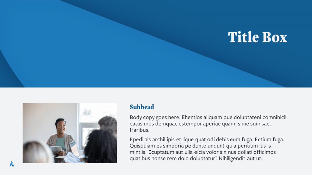
CONCEPT 1 – Angled Photo Frame


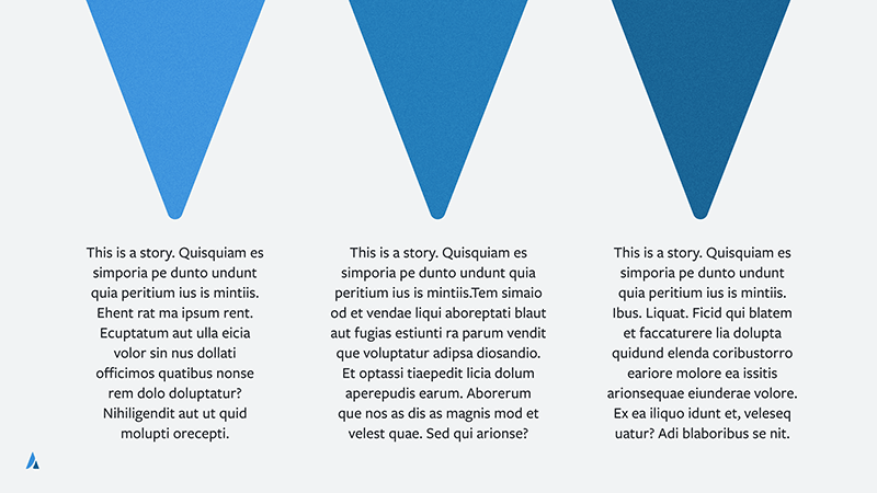


Matching the angle of the triangle in the Ad Astra logo, I created some slides using that shape for a photo container for this concept. While the client liked this idea, they preferred the execution with the more dynamic shape of the swoop/path, as seen in Concept 2. I also applied a subtle grain texture to the background graphics, but received feedback from the client that they preferred it smooth/flat.
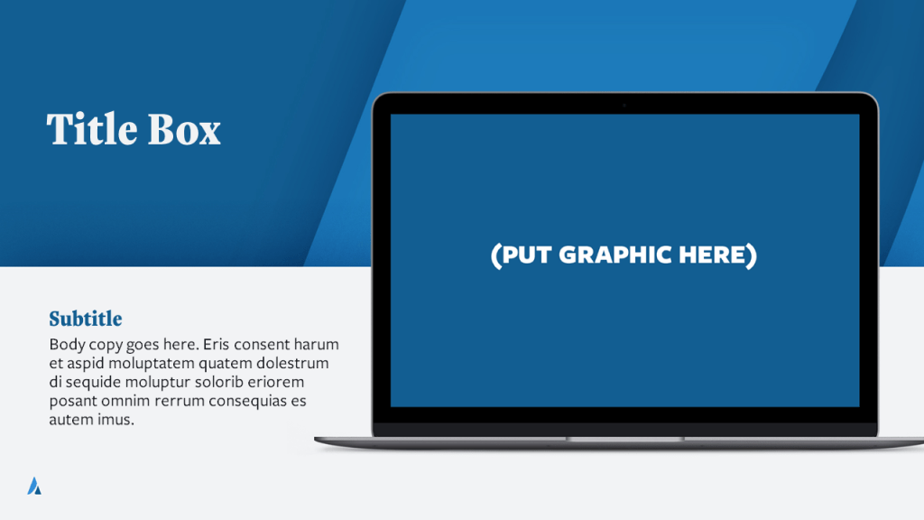
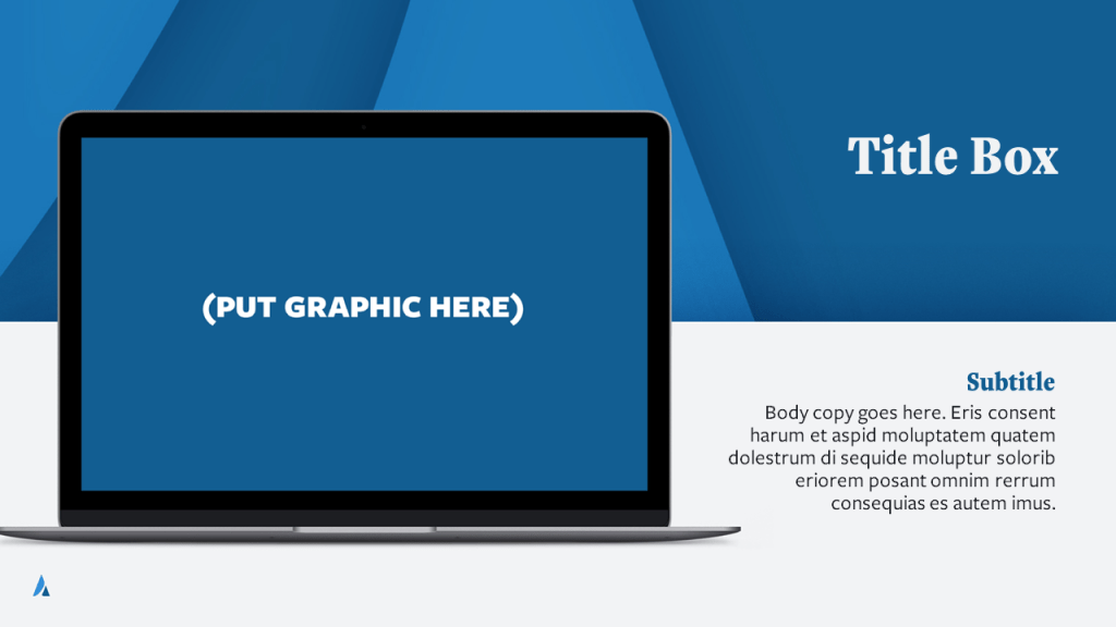
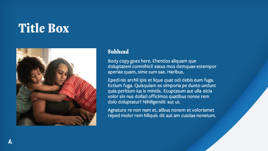
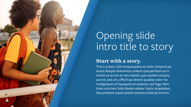
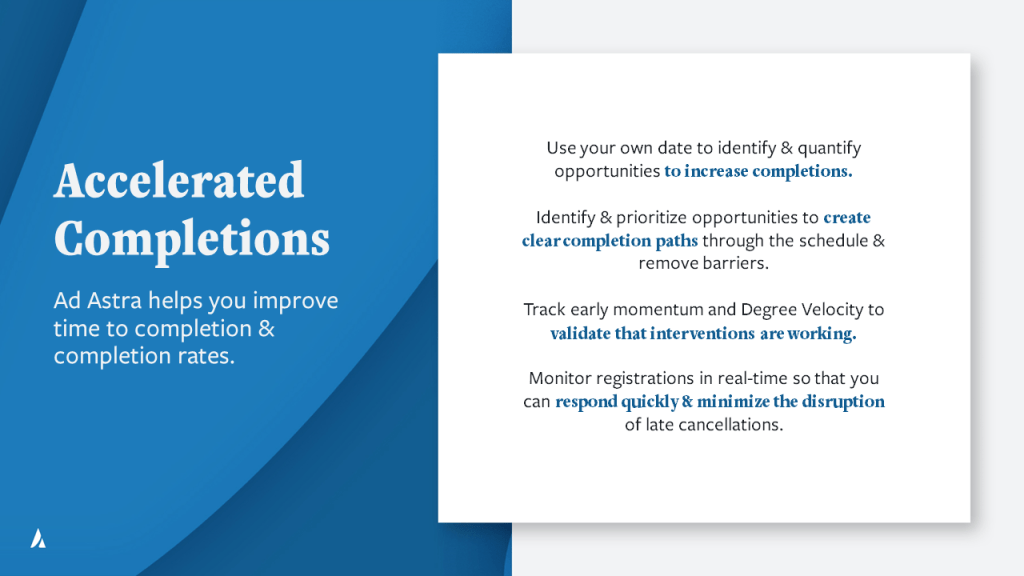
CONCEPT 2 – Swoop Photo Frame

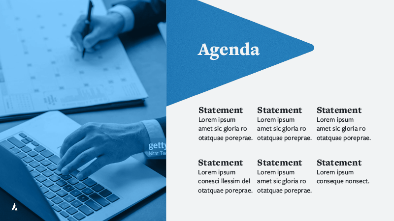


The dynamic shape of the upward swooping path in the Ad Astra logo really stood out to me, so I copied that shape to create a container for a photo. The shape represents what the brand is trying to do for students – help students graduate faster. It seemed like a nice way to consistently weave the brand throughout the deck while being representative of both the brand and the concept.
Final
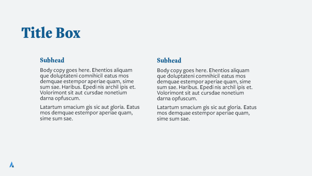
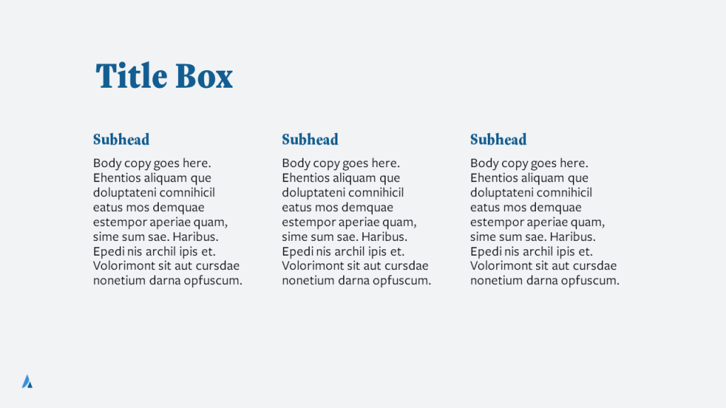
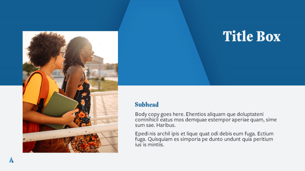
Blending some of the slides from each concept deck and revising, I was able to produce a 40-slide Microsoft PowerPoint Template, ready for any Ad Astra employees to use, that would cover all of their eventual and potential needs.
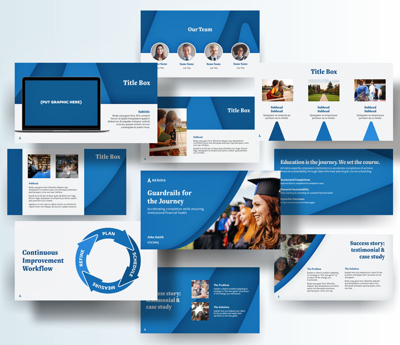
I based the design on a 12-column grid, used a set of consistent type sizes (based on Fibonacci sequence), and focused on 3 typefaces from Ad Astra’s brand fonts, FreightText Pro and FreightSans Pro. I also included the Ad Astra icon in a consistent placement in all slides to keep the branding throughout.


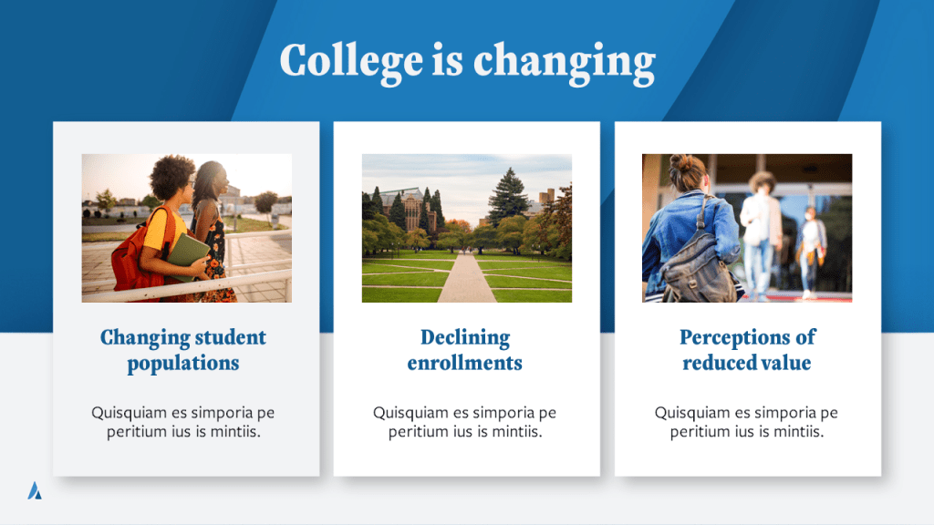


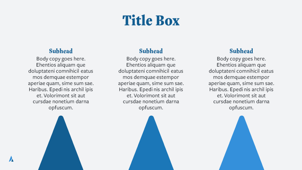


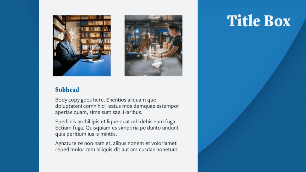

The consistency of type styles and treatments as well as the alignment of all the text and photos to the grid, plus the use of the three brand blues and the brand grey and brand white, all worked together to create a cohesive branded template, representational of Ad Astra’s feeling, voice, and brand.